
Visualizing Rivers and Floodplains with USGS Data
Using USGS elevation data to visualize stunning views of the flow of water through rivers and floodplains.

The U.S. Geological Survey (USGS) is REALLY close to an incredible goal: by 2023 it aims to have a super detailed 3D scan of every square mile of United State territory. The USGS’ 3D Elevation Program maintains an incredible database of this detailed geometry – much of it "digital elevation model" (DEM) data – and it has built some powerful tools for the public to download and explore this data. This data was all scanned using LiDAR imaging, and it records every mountain, ridge, lake, stream and crevice with varying degrees of detail (some much, much higher than others).
Much like states who drive every mile of their highways to catalog every crack and bump in the road, having a detailed database of the actual geometry of your country’s land is an extremely useful resource, with tons of useful applications. This technology has been used to visualize changes to the landscape after earthquakes, floods, landslides and volcanic eruptions.
One of the simplest things this data can tell you is the elevation of things – how far above or below sea level is any given point on a map. As sea levels rise due to climate change, these tools have become essential to understanding the flow of water on our nation’s shores, bays, rivers and floodplains.
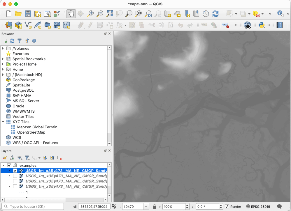
Using geographic data visualization tools like the awesome and free, open source QGIS, you can open and explore this detailed data, rendering “hillshade” maps where you can enhance the elevation and adjust a virtual lightsource, render contour lines around hills and mountains and you can also use colorful visualizations to highlight elevation changes. QGIS also acts as a sort of Photoshop, where you can mix and match these various layers and stack them on top of each other.
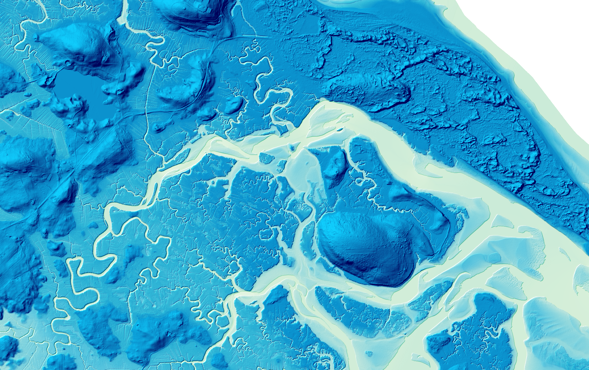
I have been exploring the ways you can use this fantastic public data to visualize the flow of water in different places around the U.S. using some fantastic tutorials by Daniel Coe, Graphics Editor for the Washington Geological Survey in Olympia, Washington. Coe’s collection of river visualizations are simply stunning, and worth checking out on a large screen. He’s made dozens of them available in hi-res for non-commerical use on his Flickr page. There’s a great interview with Coe talking about his work available here.
Samples of Daniel Coe's Work
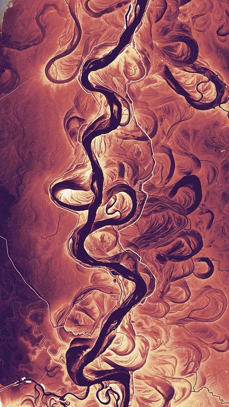

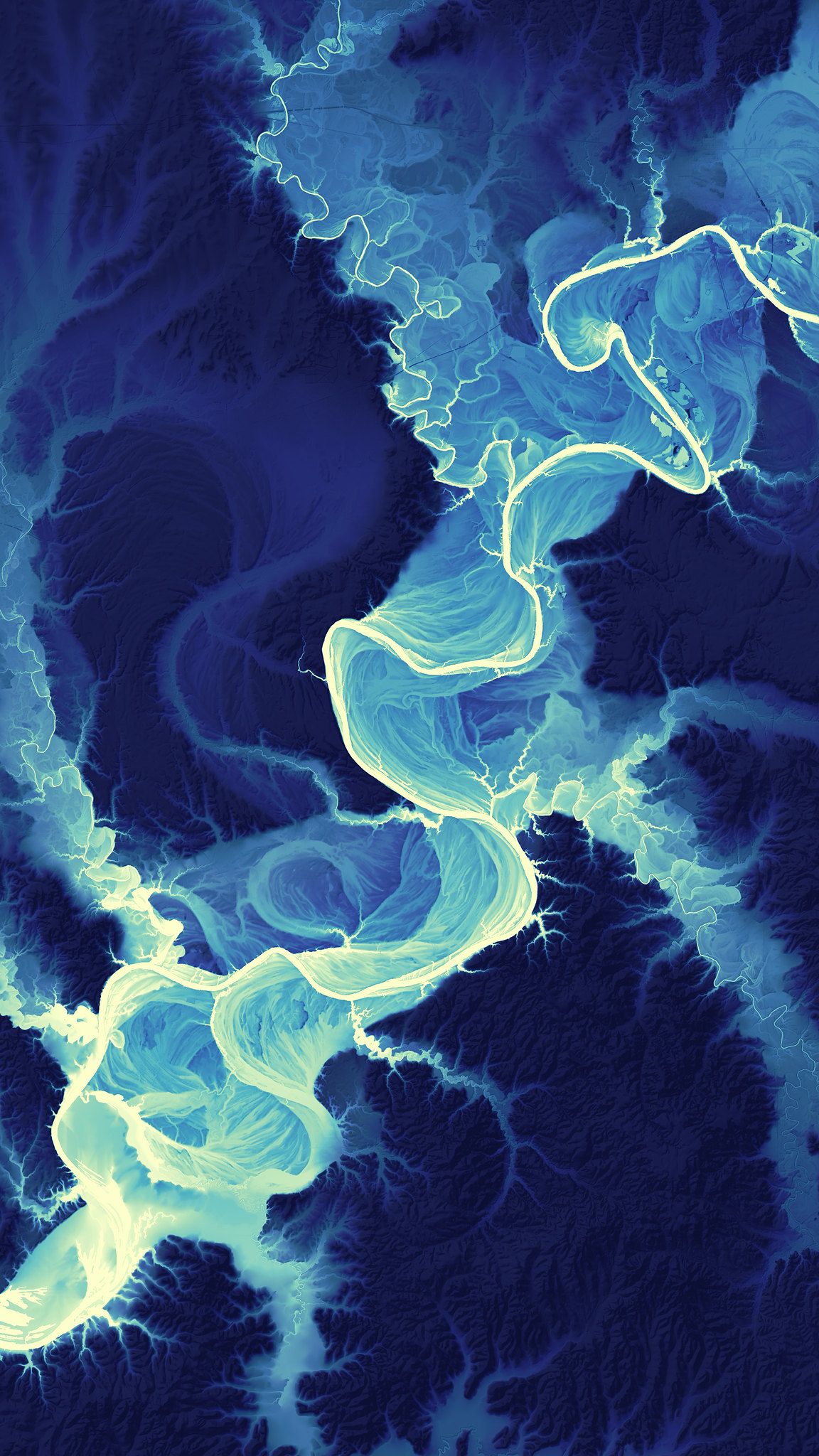
Some samples of Daniel Coe's incredible REM work. Credit: Daniel Coe / CC BY-NC-ND 2.0 / Links: Image 1 Image 2 Image 3
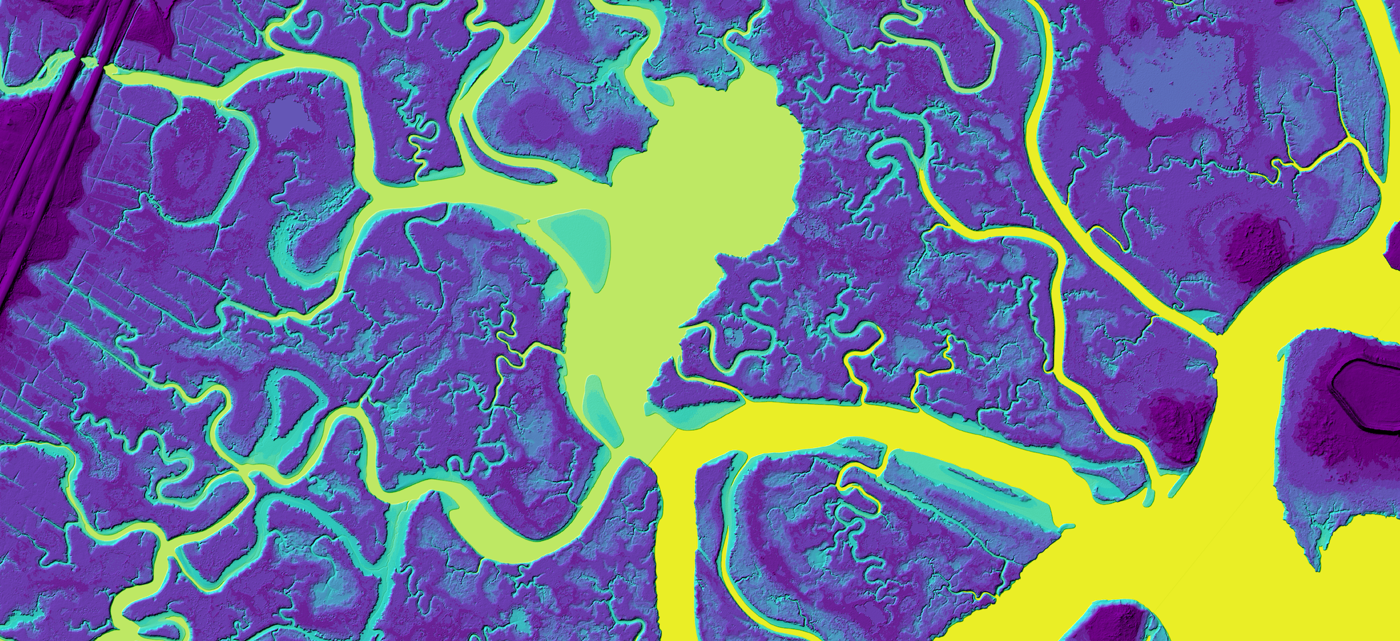
After playing around with this data in QGIS, I quickly realized the subtle, but cool thing that Coe’s visualizations are doing. Coe’s most dramatic images utilize a technique called “relative elevation modeling” (REM) which uses the surface of a waterway as the base elevation, and colors are used to indicate the elevations relative to the water’s surface, above and below that level. This addresses an interesting issue with regular elevation data including rivers and other waterways – the upstream water always has a slightly higher elevation. So the REM technique addresses this by kind of flattening the elevation of the water along the entire path, and conforming the rest of the elevation to that adjustment. Super cool, and his QGIS tutorial is extremely detailed and thorough (though my examples that I made for this post aren't technically done with this method).
Also there’s a neat Python library called RiverREM made by OpenTopography intern Kenneth Larrieu (whom I hope they hired) which will take any “digital elevation model” DEM file (often a GeoTIFF) that has a named river in it, and it will spit out one of these REM visualizations with very little effort.
You can explore a zoomable map of the U.S. to see what DEMs or LiDAR data are available (and at what resolutions) using the easy to use 3DEP LiDAR Explorer tool. Also many states maintain their own DEM / LiDAR datasets outside of the USGS.
I have really enjoyed playing around with QGIS to experiment with this data, and of you have ever worked with Photoshop, you should be able to get a hang of the basics. Of course this kind of visualization only scratches the surface of what you can do with QGIS, which integrates with PostGIS allowing for powerful geospatial queries for any kind of geographic data.
Working on this post, playing with this data, learning some new tools and techniques and making some beautiful things to share with you all is EXACTLY the kind of thing I wanted to do when I started this newsletter. 🖖🏻
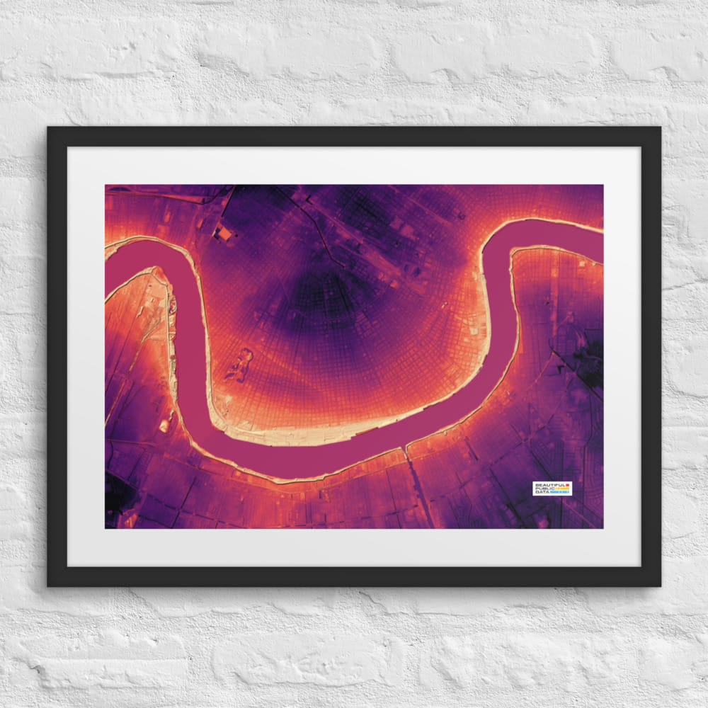
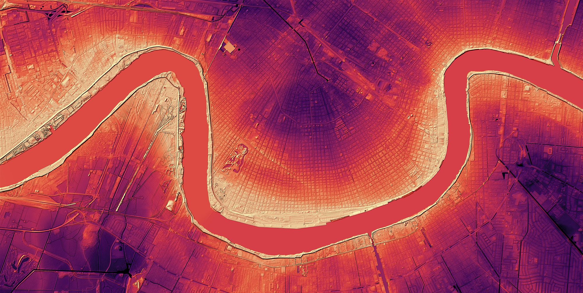
New Orleans Elevation Map — USGS LiDAR Elevation Data Art Framed Print
This visualization of USGS digital elevation data captures the sinuous Mississippi River winding its way through New Orleans. The sharp bends of the river gave the Crescent City its name. But this unique view of this high-resolution data also reveals the story of the challenging topography of the city — densely packed neighborhoods along the edge of the river's natural levees (in bright yellow), descending into a basin that sits as much as five feet below the river's water level (in dark purple). This is a "bare-earth" visualization from LiDAR data, which removes buildings, trees and other structures from the rendering.
Source data: USGS 2017 Upper Delta Plain 1-Meter Digital Elevation Model.
For this post, I used QGIS, and the RiverREM Python library.
If you want to learn more about LiDAR stuff, be sure to check out OpenTopography which is full of great resources, tools and all the LiDAR / topographic data you can handle.
You can subscribe to our newsletter to get future posts delivered to your inbox for free. 👉🏻 📫 Subscribe now.
Sharing is caring
📣 If you think your followers or friends may like it, please consider sharing it.
🙋🏻♀️ If you have any suggestions, comments or requests, please email them to beautifulpublicdata@gmail.com
Thanks for reading!
- Jon Keegan (@jonkeegan)