
Visualizing Ship Movements with AIS Data
Explore the beautiful, intricate paths of ships over a year—tracked from America's busiest ports to the open ocean via AIS marine tracking data.


As we run, drive, bike, and fly, humans leave behind telltale tracks of movement on Earth—if you know where to look. Physical tracks, thermal signatures, and chemical traces can reveal where we’ve been. But another type of breadcrumb trail comes from the radio signals emitted by the cars, planes, trains, and boats we use.
Just like ADS-B transmitters on airplanes, which provide real-time location, identification, speed, and orientation data, the AIS (Automatic Identification System) performs the same function for ships at sea.
Operating at 161.975 and 162.025 MHz, AIS transmitters broadcast a ship’s identification number, name, call sign, length, beam, type, and antenna location every six minutes. Ship location, position timestamp, and direction are transmitted more frequently. The primary purpose of AIS is maritime safety—it helps prevent collisions, assists in rescues, and provides insight into the impact of ship traffic on marine life.

Unlike ADS-B in a plane, AIS can only be turned off in rare circumstances. The result of this is a treasure trove of fascinating ship movement data. You can even watch live ship data on sites like Vessel Finder.
Using NOAA’s “Marine Cadastre” tool, you can download 16 years’ worth of detailed daily ship movements (filtered to the minute), in addition to “transit count” maps generated from a year’s worth of data to show each ship's accumulated paths.
I downloaded all of 2023's transit count maps and loaded them up in QGIS to visualize this year of marine traffic.
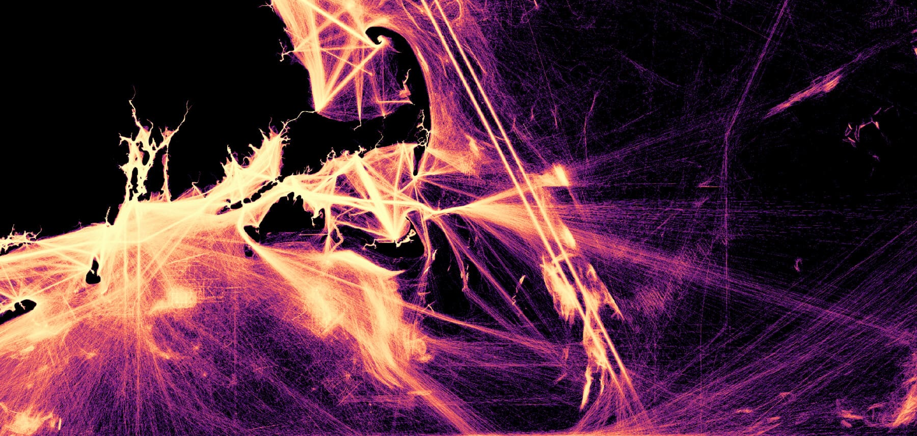
The resulting maps are abstract, electric and revealing. . When you remove the landmasses from the map and leave only the ship traces, the lines resemble long-exposure photos of sparklers, high-energy particle collisions, or strands of illuminated fiber optic wire. However, when you reveal ports, harbors, islands, and ferry lines, the ship traces take on meaning and order.
Only by adding the fourth dimension—time—can we fully appreciate the etched markings of our journeys across rivers, lakes, and oceans.
When you zoom into these maps, you can sometimes make out eerie patterns, that look like crude graffiti scratched with a sharp pen, or neat clusters of geographic lines. Some of these are fishing grounds, others scientific surveys mapping the sea floor, and others show the traffic of boats going to and from offshore oil rigs, like the many constellations of light found off Louisiana's gulf coast.
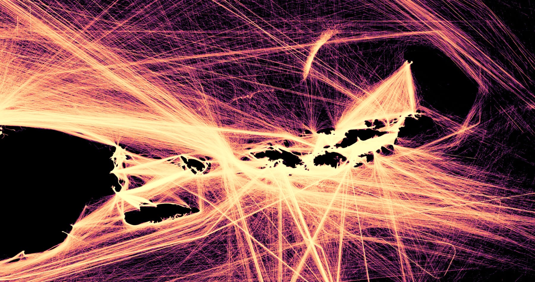


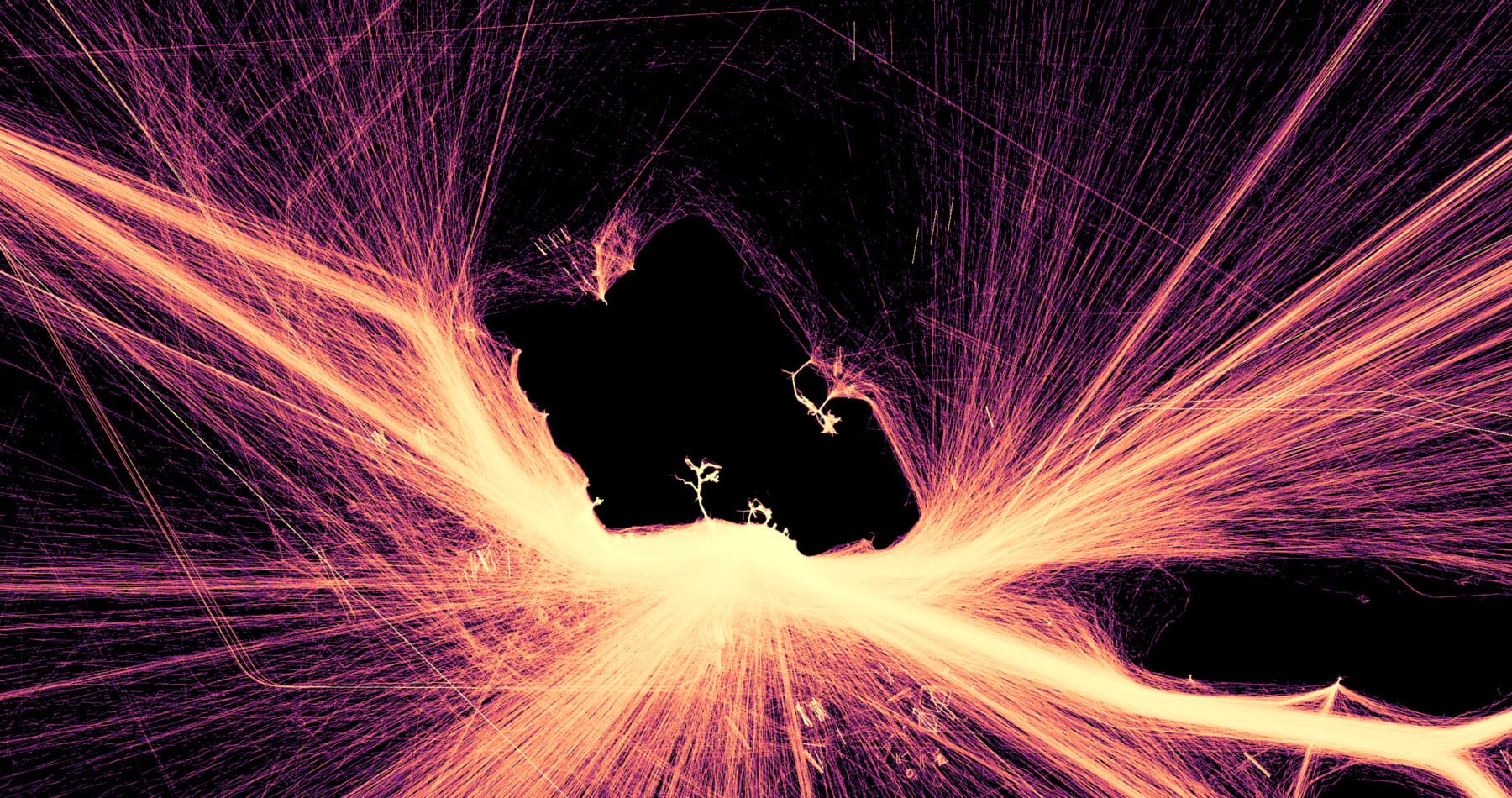


Top left to right: Puerto Rico, US & British Virgin Islands; Chicago, IL; Norfolk, VA. Middle left to right: Florida, Gulf of Mexico; Gulf of Mexico; Hawaii. Bottom left to right: Los Angeles; Louisiana; Lake Huron. Data: NOAA; Map: Jon Keegan / Beautiful Public Data
Spoofing to evade sanctions
Having a global, near-real-time system for tracking the precise movements of all ships at sea sounds like a great innovation—unless you’re trying to keep your ships’ movements and cargoes secret.
In 2023, Bloomberg investigated how Russia evaded sanctions on its oil exports after the invasion of Ukraine, partly by spoofing AIS systems to mislead observers. Observing a fleet of rusting ships of questionable seaworthiness, Bloomberg’s reporters compared AIS data with what they saw on the ground—and discovered discrepancies.
This may have been due to intentional AIS “spoofing,” where false ship coordinates were transmitted.
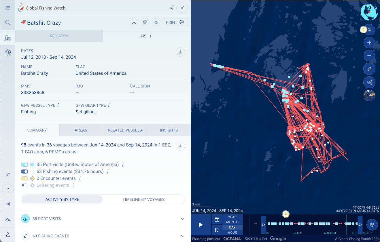
Monitoring the fishing industry
Global Fishing Watch is a non-profit organization that seeks to monitor the fishing industry in an effort to protect marine life from over-fishing. According to Global Fishing Watch, only 2% of fishing vessels use AIS transmitters.
Founded by Google, ocean conservation group Oceana and satellite imagery company SkyTruth Global Fishing Watch analyzes AIS data from fishing vessels, but combines that data with satellite imagery and uses machine learning to classify the type of fishing technology being used.


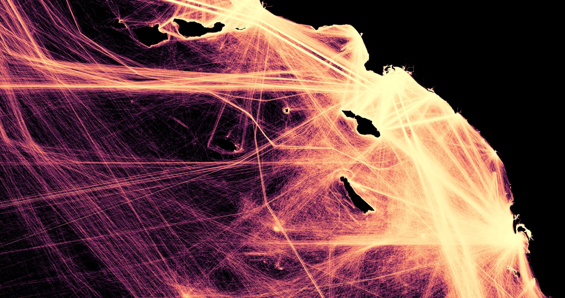
Left: Savannah, GA. Right: Victoria BC, Seattle, WA. Data: NOAA; Map: Jon Keegan / Beautiful Public Data
For this post, I downloaded CSV ship data, and transit count GeoTIFF files from NOAA's Marine Cadastre database. Working with CSVs with the millions of individual data points proved too cumbersome (but cool for animations), so I then switched to the GeoTIFFs, which I loaded into the ever-amazing open-source QGIS, playing around with layer styles to get the right effect. 🚢🛳️📡
If you live near the ocean, or a major river, you can receive AIS signals on a cheap SDR dongle using a decoder like SDRAngel. Just load it up to 161.975 and 162.025 MHz.
I'm not sure if this is still supported, but you can also use Marc Dacosta's amazing Ambient Shipping tool to find out not only what ship is passing by, but what is listed on the cargo manifest. You should read about it. Such a creative idea.
You can subscribe to our newsletter to get future posts delivered to your inbox for free. 👉🏻 📫 Subscribe now.
☕️ Buy me a coffee
Say thanks with a one time tip.
Sharing is caring
📣 If you think your followers or friends may like it, please consider sharing it.
👕🖼️ Buy Beautiful Public Data merch on our Etsy shop
Unique t-shirts and prints inspired by our stories
🙋🏻♀️ If you have any suggestions, comments or requests, please email them to beautifulpublicdata@gmail.com
Thanks for reading!
- Jon Keegan
Bluesky: @jonkeegan.com
Mastodon: mastodon.social/@jonkeegan

Buy Framed Prints of AIS Ship Visualizations
Ships at sea are constantly broadcasting their real-time location, identification, speed, and orientation data via AIS. Plotting out a years worth of ship movements (2023) reveals beautiful patterns of our journeys at sea. Ferries, fishing boats, cargo ships and sailboats' coordinates etch electric pathways in these stunning visualizations of NOAA data.
🚢 Adding new maps soon!