
The USGS Cooperative National Geologic Map
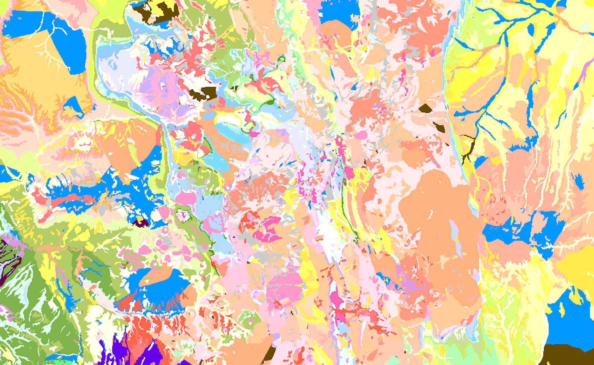
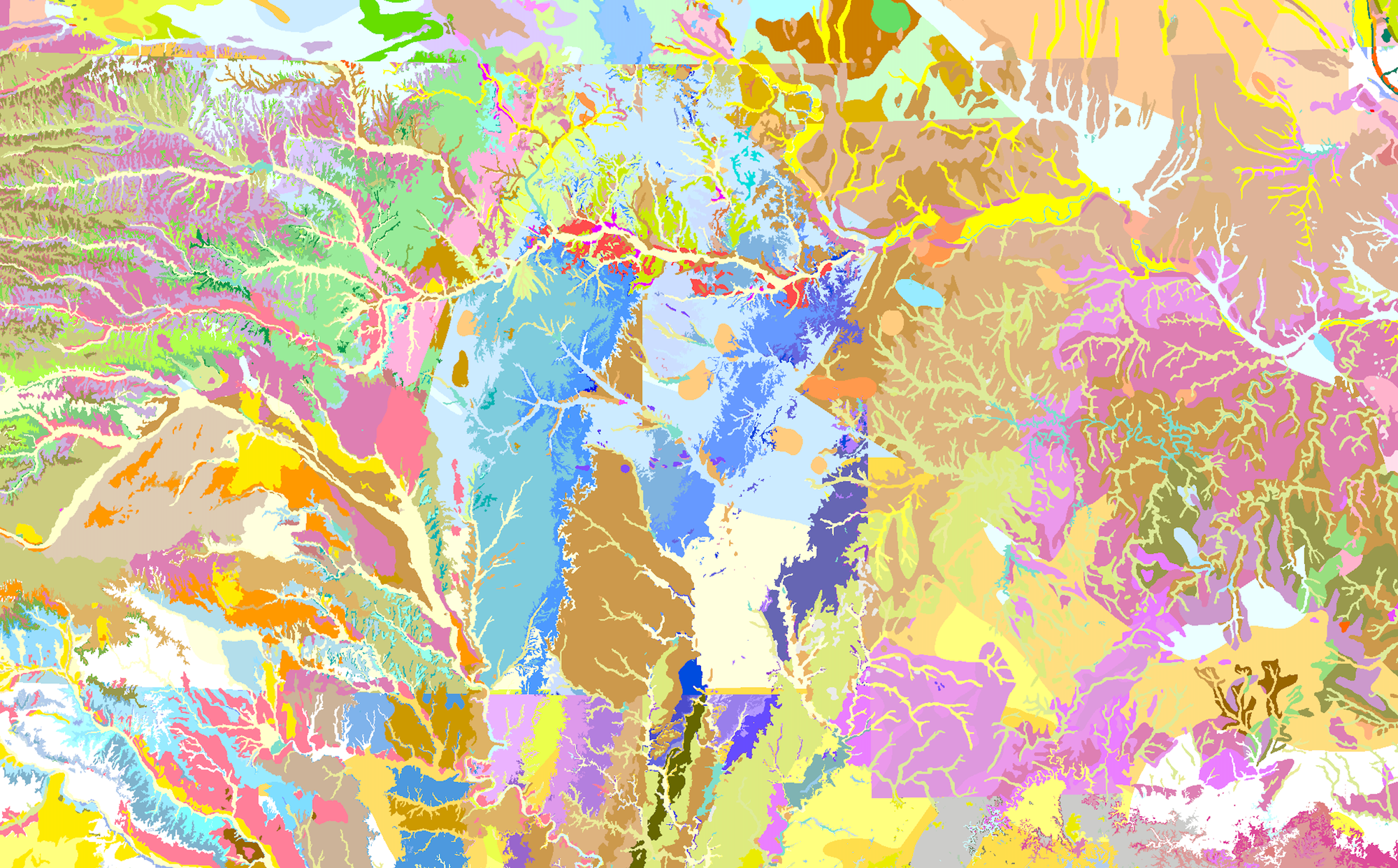
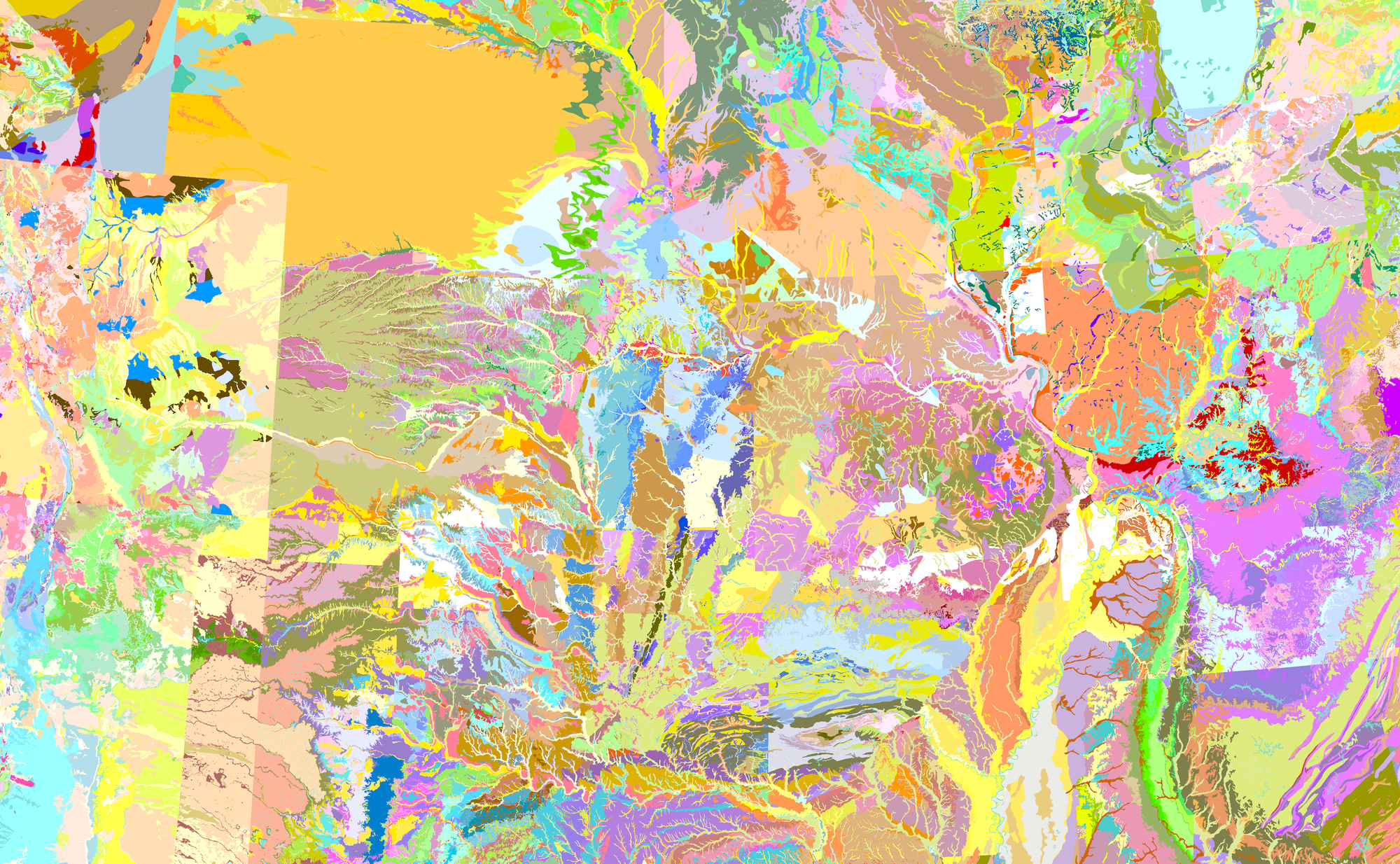
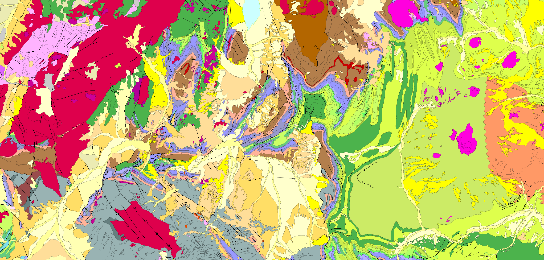
A new, colorful map from the USGS synthesizes decades of state and federal geologic surveys to create the most detailed visualization of the geology of the contiguous United States to date.


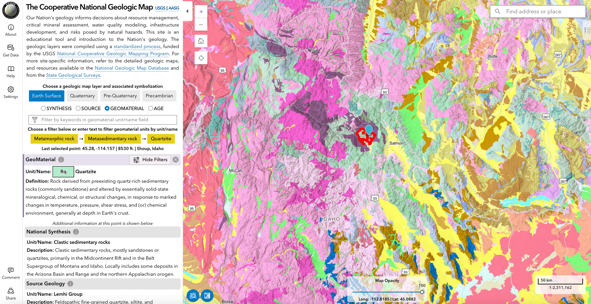
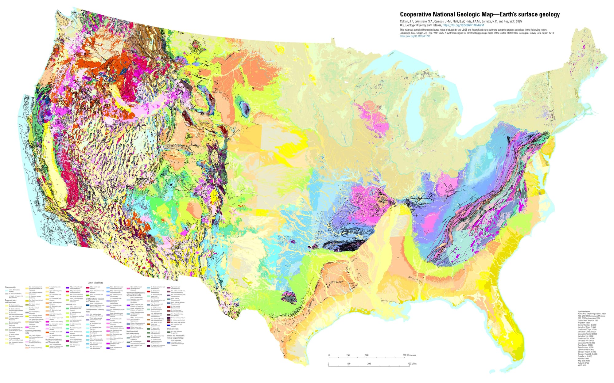
This summer, the United States Geological Survey (USGS) completed an ambitious project — the most detailed geologic map ever produced for the lower 48 states. The “Cooperative National Geologic Map” integrates decades of state survey data, letting the public see exactly what kinds of rocks lie beneath their feet.
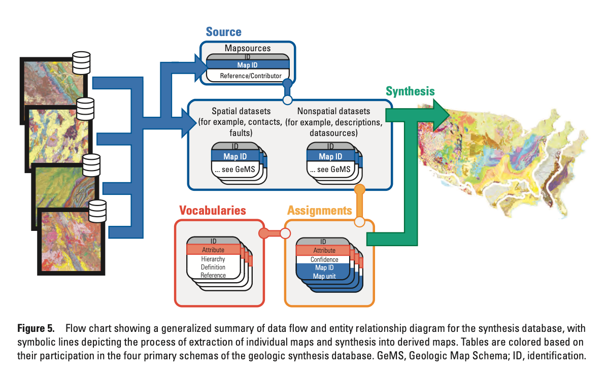
Researchers at the USGS developed a largely automated process to synthesize a new map from archival geologic maps drawn from multiple sources. Roughly 100 maps were compiled to generate the final product.
Researchers had to contend with inconsistent rock-unit names and varying interpretations of their geologic ages. A standardized vocabulary brought consistency across states, and the many source databases were normalized so the datasets could be queried together.
The free, public-domain maps are used by government agencies and industries—from energy to real estate to civil engineering—to plan land use and manage mineral and natural resources. They also help identify hazards and assess vulnerabilities to threats such as landslides, earthquakes, and floods.
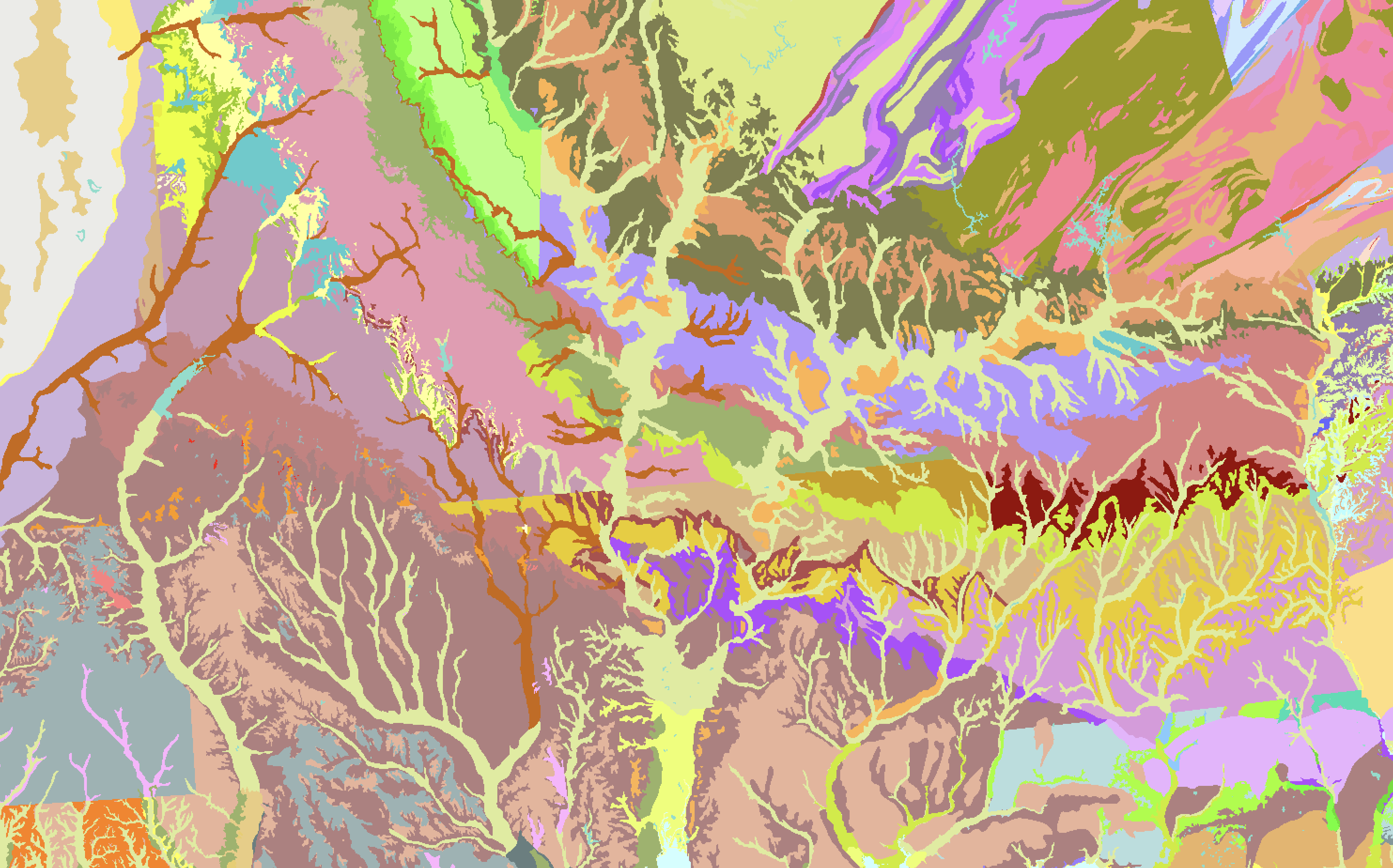
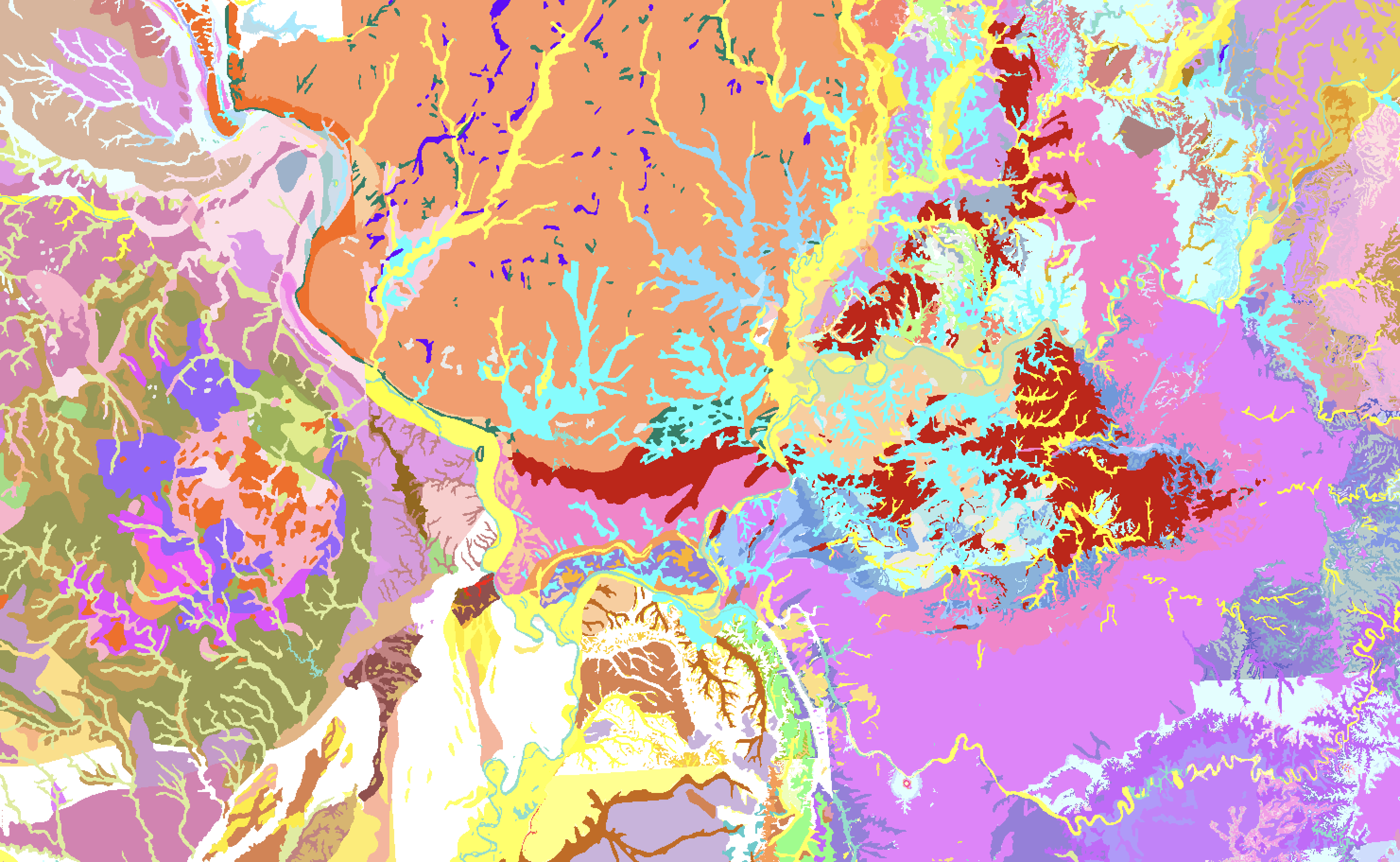
The colorful maps are mesmerizing, offering a rich, detailed portrait of the American landscape. Bright boundaries of geologic zones that blot out any political borders seem to re-order the country into its natural state. The undulating bands of the Appalachian range as they ripple through Pennsylvania look like cross-sections of muscle tissue under a microscope, and river systems sprawl across the land leaving colorful paths of sediment.
Each polygon’s shape reflects geologists’ interpretations of field observations, elevation models, and satellite imagery, most often synthesized from existing state geologic maps. Field observations typically involve geologists examining exposed rock outcrops up close — describing their composition, structures, and boundaries.

A recent analysis quantified the federal return on investment for producing these detailed geologic maps. According to a report from the American Geosciences Institute—“Economic Analysis of the Costs and Benefits of Geological Mapping in the United States of America from 1994 to 2019”—the maps deliver remarkable value.
The report found: “Every dollar invested in geologic mapping returned about $7 to $10 in economic benefits, with a total investment of $1.99 billion fostering $20.61 billion in value.”
The maps also proved popular, with more than 7 million copies downloaded or sold during the 25-year study period.
The project produced four distinct maps, each showing a different slice of America’s geology:
- Quaternary geology — young surface deposits and rocks from 2.58 million years to the present
- Geology at the Earth’s surface — exposed rocks and minerals visible on the ground
- Pre-Quaternary geology — older rocks from before the Quaternary Period (older than 2.58 million years)
- Precambrian geology — the oldest, deepest rocks, more than 541 million years old
Despite clear evidence of the maps’ economic value to government and industry, the USGS is facing steep cuts in the Fiscal Year 2026 budget. The FY25 budget allocated $46.3 million for the National Cooperative Geologic Mapping Program, but the new spending bill slashes that funding by about 39%:
“USGS provides science information on natural hazards, ecosystems, water, energy and mineral resources, and mapping of Earth’s features. The Budget eliminates programs that provide grants to universities, duplicate other Federal research programs and focus on social agendas (e.g., climate change) to instead focus on achieving dominance in energy and critical minerals.”

Buy Framed Prints of AIS Ship Visualizations
Ships at sea are constantly broadcasting their real-time location, identification, speed, and orientation data via AIS. Plotting out a years worth of ship movements (2023) reveals beautiful patterns of our journeys at sea. Ferries, fishing boats, cargo ships and sailboats' coordinates etch electric pathways in these stunning visualizations of NOAA data.
🚢 Adding new maps soon!
You can subscribe to our newsletter to get future posts delivered to your inbox for free. 👉🏻 📫 Subscribe now.
☕️ Buy me a coffee
Say thanks with a one time tip.
Sharing is caring
📣 If you think your followers or friends may like it, please consider sharing it.
👕🖼️ Buy Beautiful Public Data merch on our Etsy shop
Unique t-shirts and prints inspired by our stories
🙋🏻♀️ If you have any suggestions, comments or requests, please email them to beautifulpublicdata@gmail.com
Thanks for reading!
- Jon Keegan
Bluesky: @jonkeegan.com
Mastodon: mastodon.social/@jonkeegan
For this post, I downloaded the full USGS National Geologic Map Database (6.4 GB) which I loaded into QGIS.