
Design for the People: The US Web Design System and the Public Sans Typeface
The United States has an official web design system and a custom typeface that belongs to the people. This thoughtful public design system aims to make government websites not only look good, but to make them accessible and functional for all.

Before the internet, Americans may have interacted with the federal government by stepping into grand buildings adorned with impressive stone columns and gleaming marble floors. Today, the neoclassical architecture of those physical spaces has been replaced by the digital architecture of website design – HTML code, tables, forms, and buttons.
While people visiting a government website to apply for student loans, research veterans’ benefits, or enroll in Medicare may not notice these digital elements, they play a crucial role. If a website is buggy or doesn’t work on your phone, taxpayers cannot access the services they have paid for. This can feel like walking up to a boarded-up government building with broken windows, creating a negative impression of the government itself.
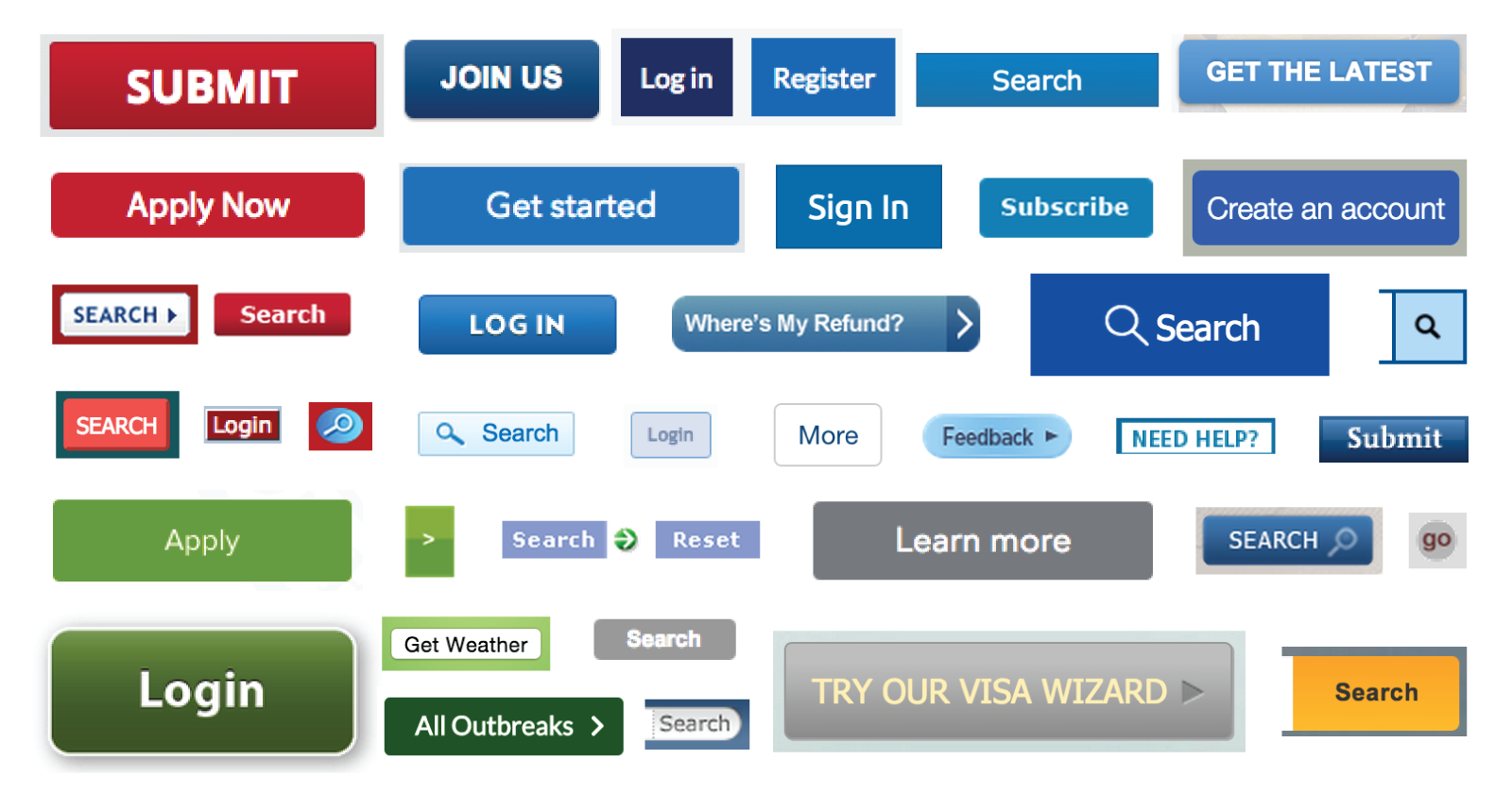
In the US, there are about 26,000 federal websites. Early on, each site had its own designs, fonts, and login systems, creating frustration for the public, and wasting government resources.
The troubled launch Healthcare.gov in 2013 highlighted the need for a better way to build government digital services. In 2014, President Obama created two new teams to help improve government tech.
Within the General Services Administration (GSA), a new team called 18F (named for their Washington, DC office at 1800 F Street) was created to “collaborate with other agencies to fix technical problems, build products, and improve public service through technology.” The team was built to move at the speed of tech start-ups rather than lumbering bureaucratic agencies.
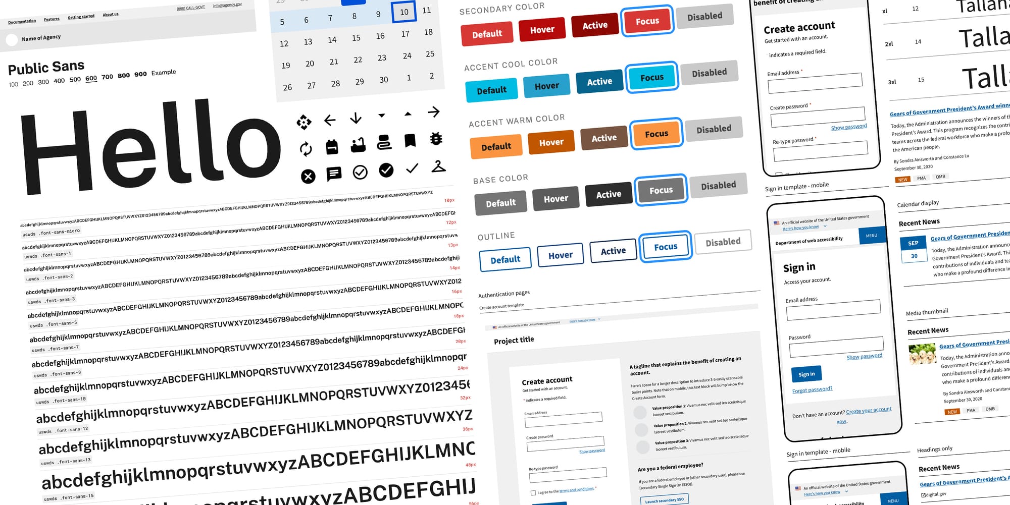
The U.S. Digital Service (USDS) was tasked “to deliver better government services to the American people through technology and design.” In 2015, the two teams collaborated to build the US Web Design System (USWDS)—a style guide and collection of user interface components and design patterns to ensure a consistent user experience across government websites. “Inconsistency is felt, even if not always precisely articulated in usability research findings,” said Dan Williams, the USWDS program lead, in an email.
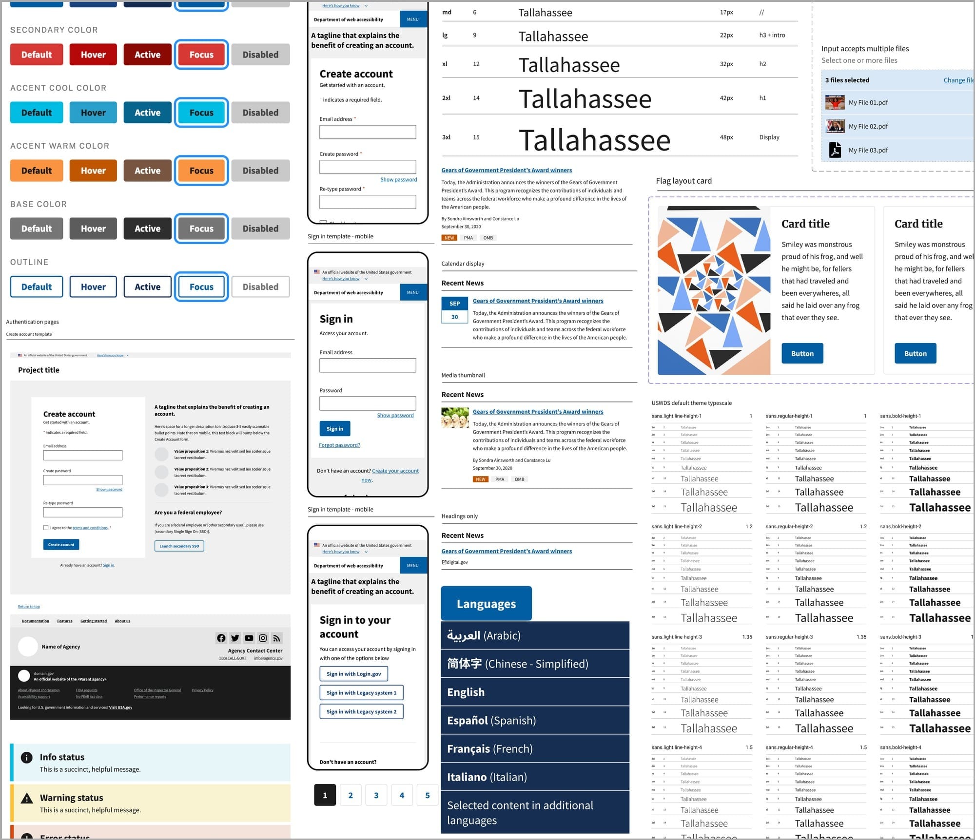
Today, the system defines 47 user interface components such as buttons, alerts, search boxes and forms each with their own design examples, sample code and guidelines such as “Be polite” and “Don’t overdo it.” The USWDS is now in its third iteration, and is used in 160 government websites. “As of September 2023, 94 agencies use USWDS code, and it powers about 1.1 billion pageviews on federal websites,” said Williams.
USWDS design principles include focusing on real users’ needs, earning trust and embracing accessibility. The system requires websites to be optimized for all users, including people with disabilities such as those using screen readers or those with color blindness. Williams said accessibility is important to the team’s efforts, noting that they “prioritize any accessibility-related bug or improvement we find (or is contributed by our community).”
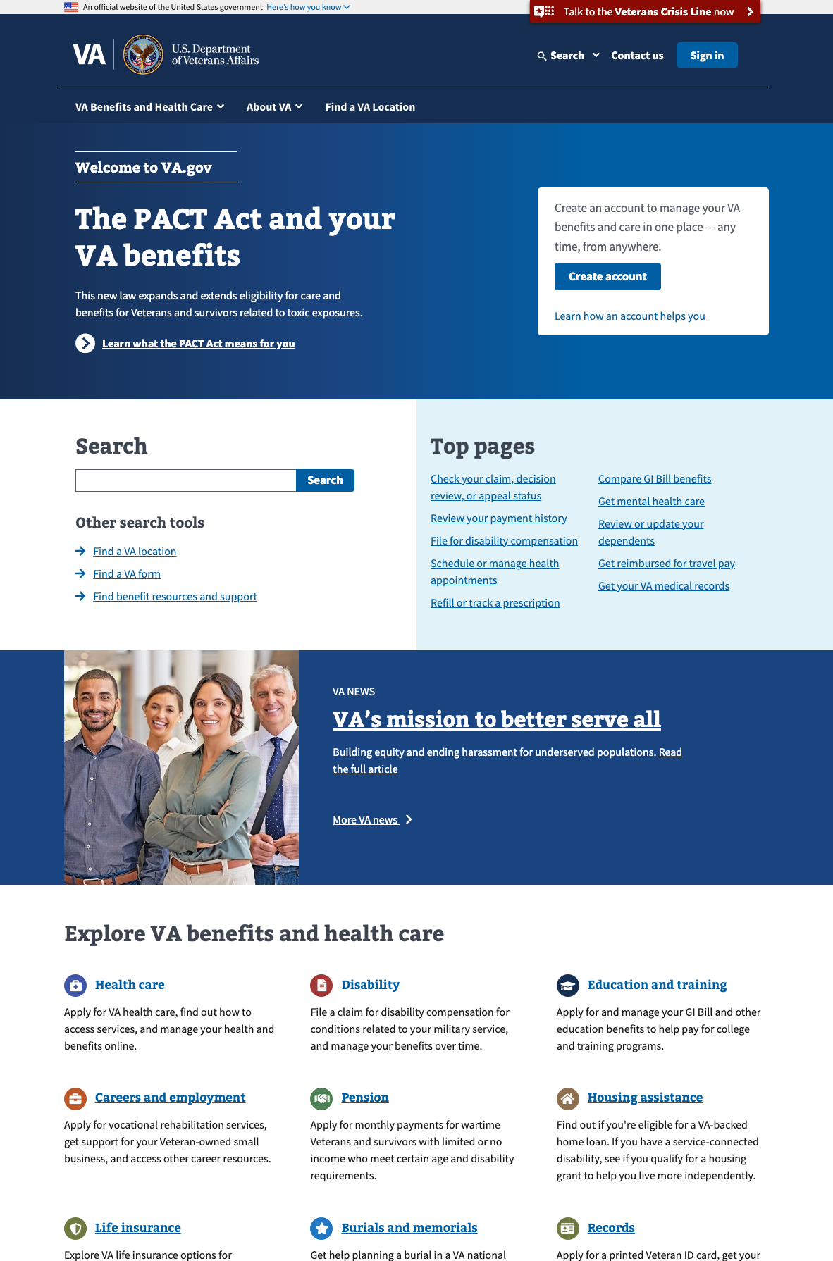
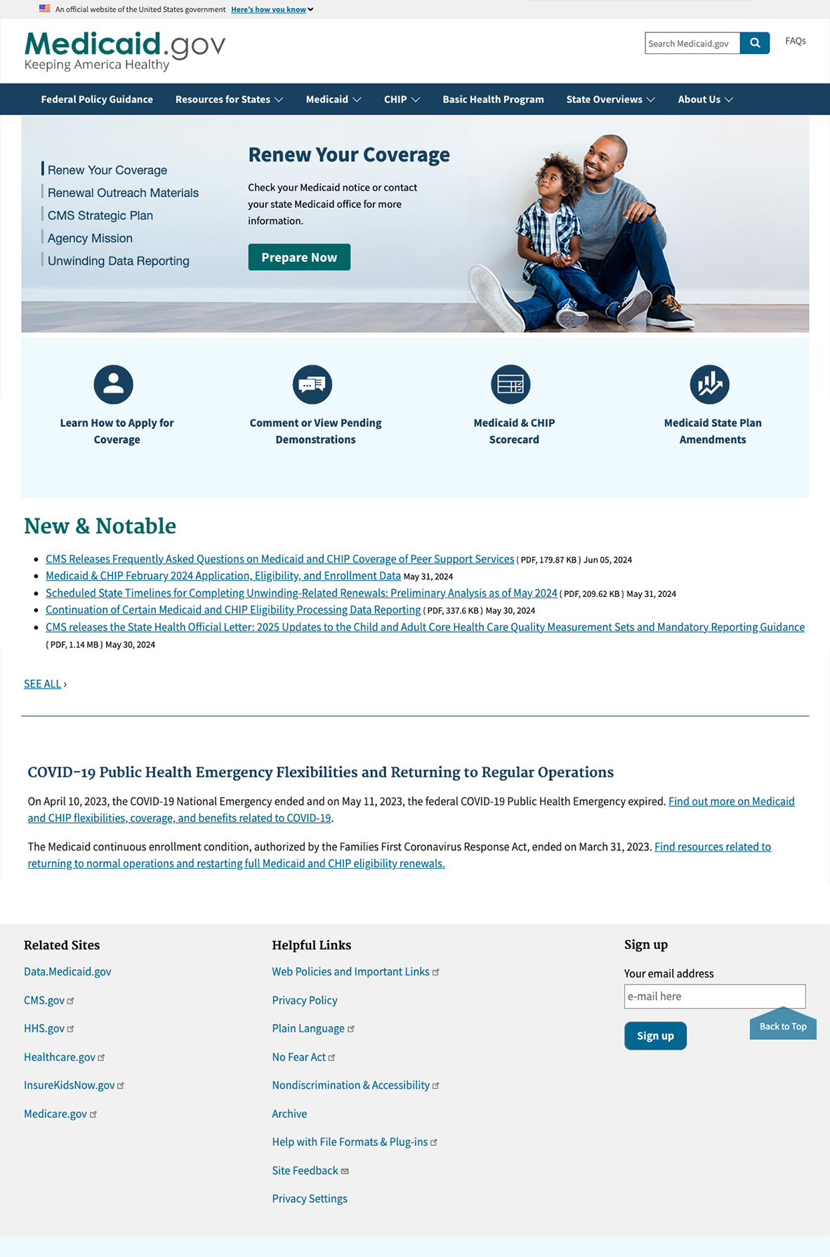
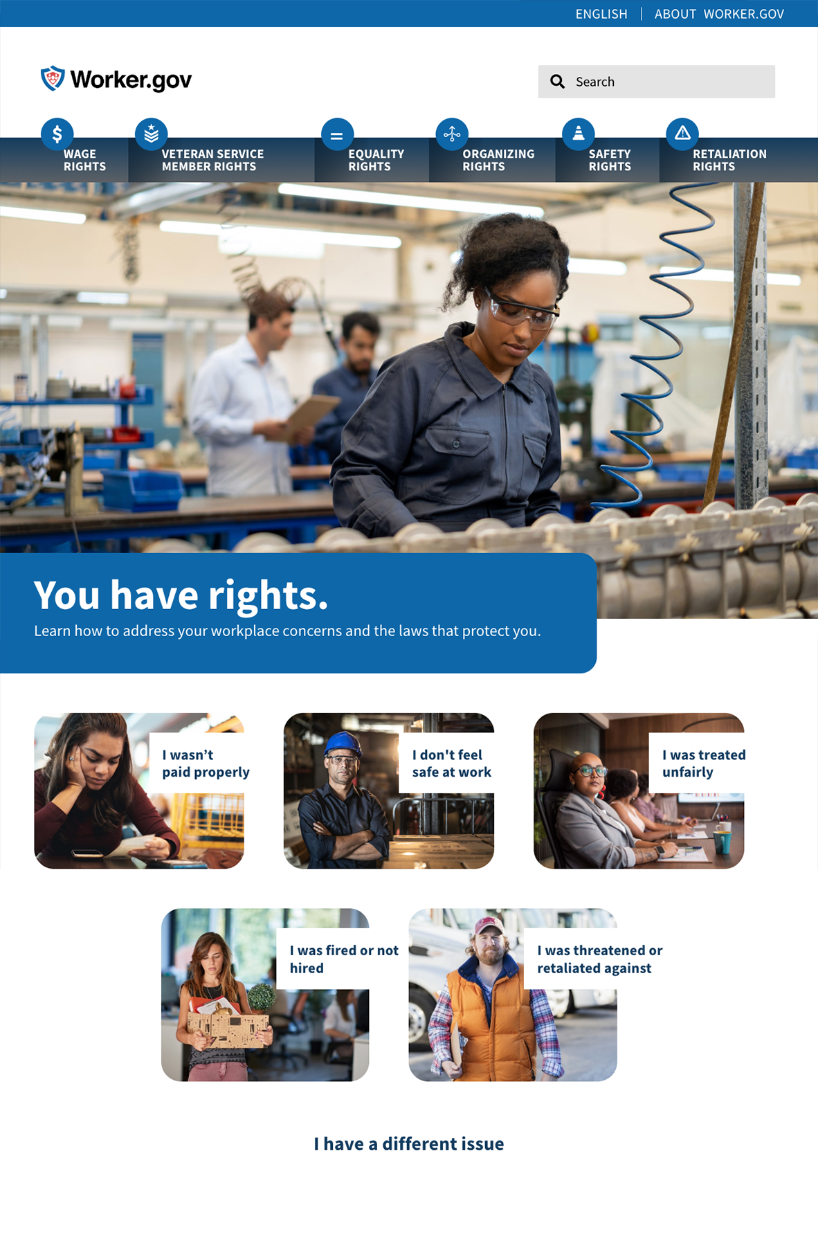
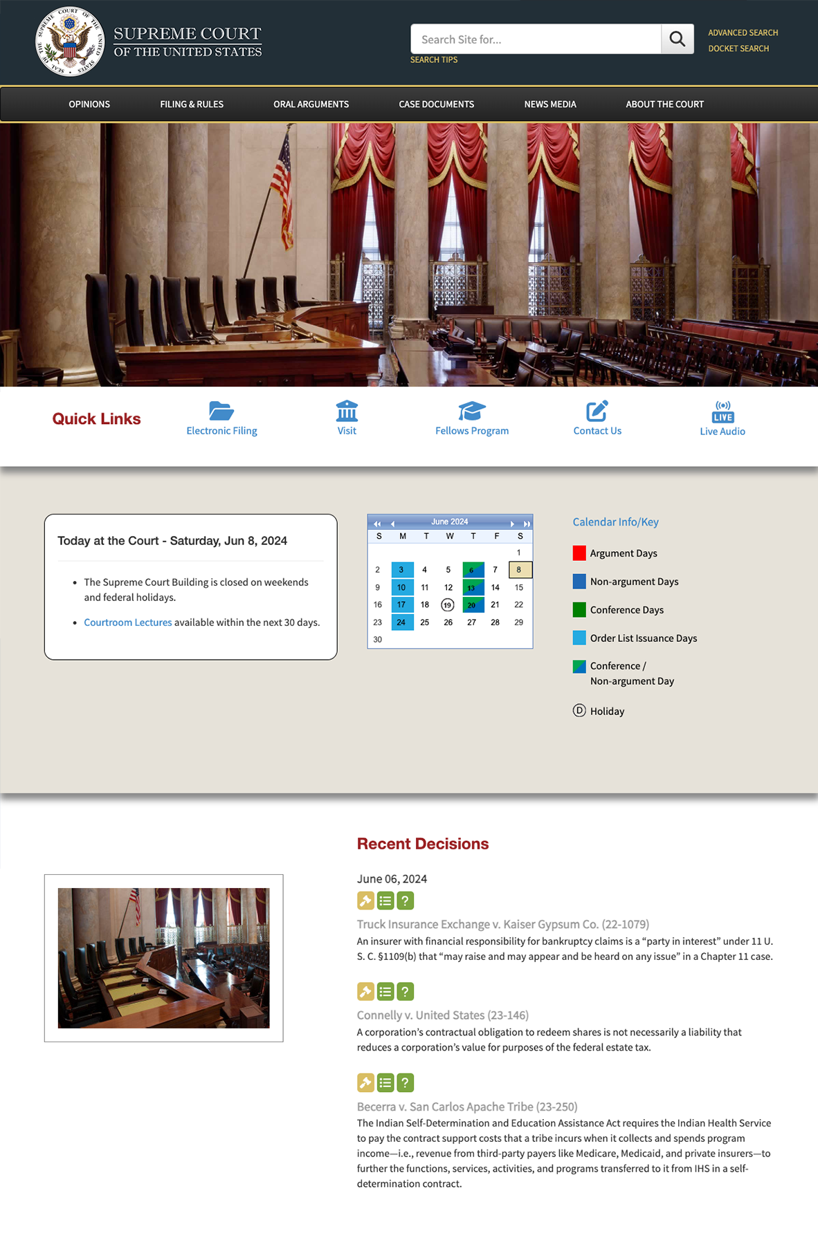
Some federal websites that use the USWDS. Clockwise from top left: Va.gov, Medicaid.gov, Worker.gov, Supremecourt.gov
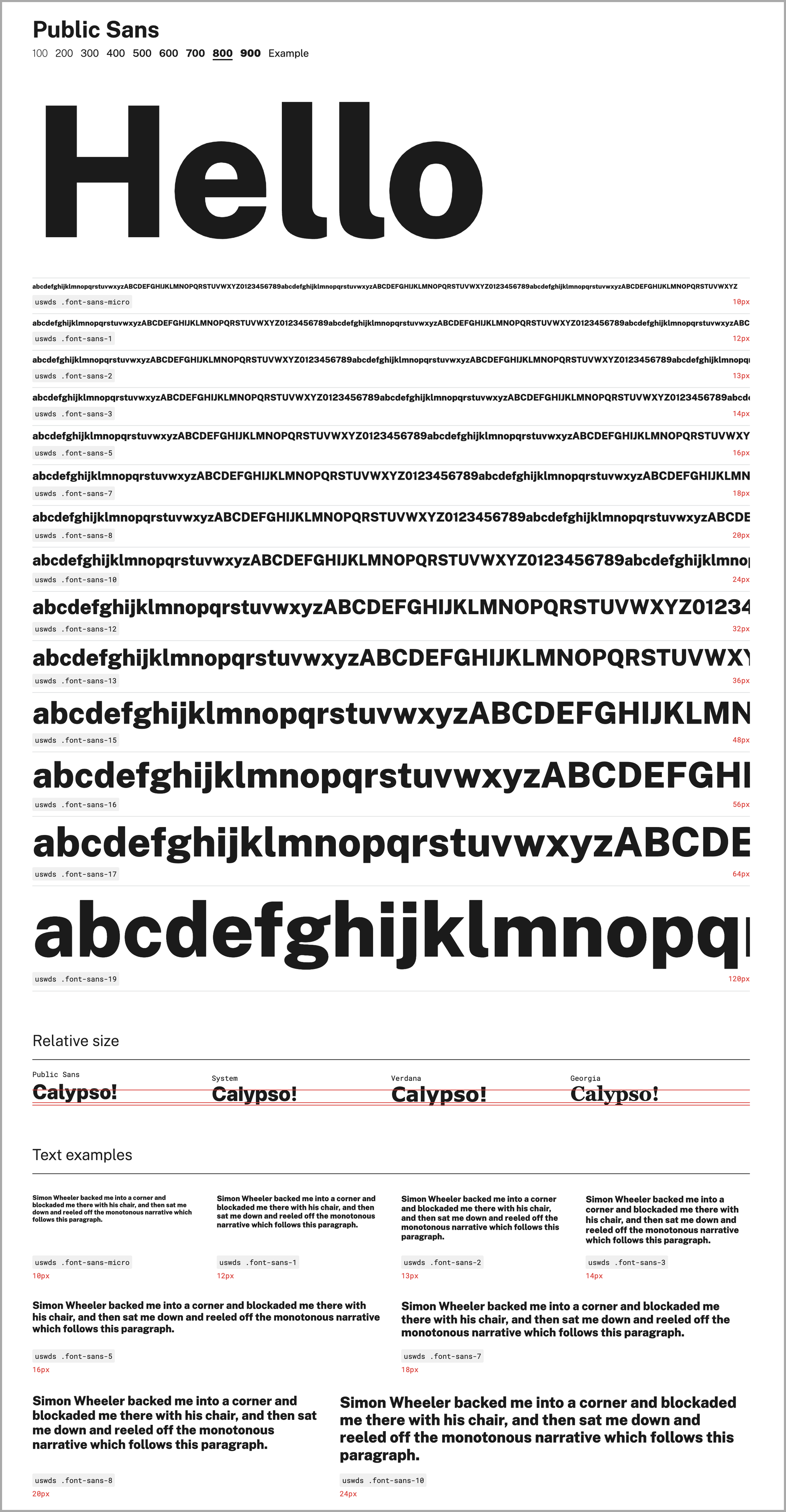
To ensure clear and consistent typography, the free and open-source typeface Public Sans was created for the US government. “It started as a design experiment,” said Williams, who designed the typeface, which was released in 2019. “We were interested in trying to establish an open source solution space for a typeface, just like we had for the other design elements in the design system,” said Williams. Based on the Libre Franklin typeface, Public Sans is described as “a strong, neutral, principles-driven, open-source typeface for text or display.”
Both Public Sans and the USWDS embrace transparency and collaboration with government agencies and the public, inviting contributions to their development via the projects’ GitHub pages.
To ensure that the hard-learned lessons of improving public technology aren’t forgotten, the projects embrace continuous improvement. One of Public Sans’ design principles offers key guidance in this area: “Strive to be better, not necessarily perfect.”
You can subscribe to our newsletter to get future posts delivered to your inbox for free. 👉🏻 📫 Subscribe now.
Sharing is caring
📣 If you think your followers or friends may like it, please consider sharing it.
🙋🏻♀️ If you have any suggestions, comments or requests, please email them to beautifulpublicdata@gmail.com
Thanks for reading!
- Jon Keegan
Threads: @jonkeeganstories
Mastodon: mastodon.social/@jonkeegan
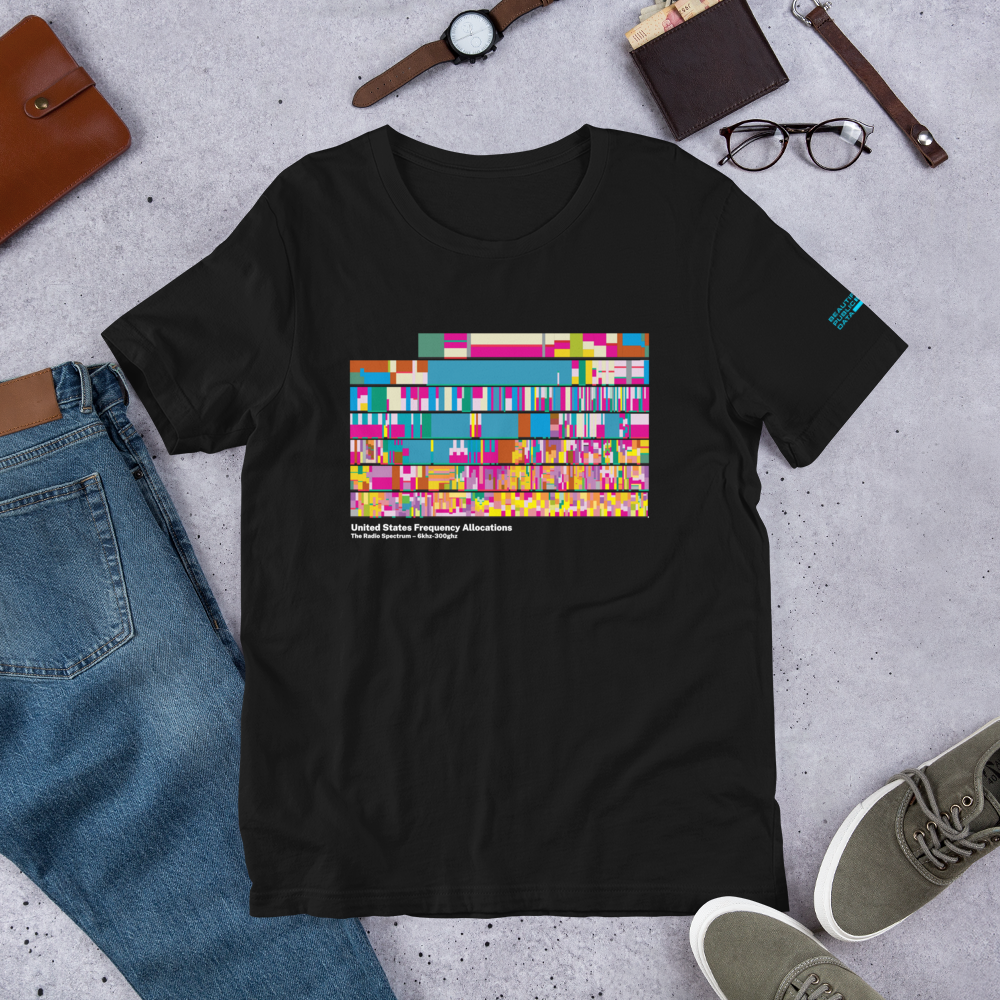
Unisex Radio Frequency Chart T-shirt
This crazy, beautiful US government chart illustrates the incredible complexity of managing one of our nation’s most crucial – and invisible – national assets: the radio spectrum. Based on the NTIA's beautiful "United States Frequency Allocation Chart".
Beautiful Public Data logo in blue on the left sleeve.