
The United States Frequency Allocation Chart
This crazy, beautiful chart illustrates the incredible complexity of managing one of our nation’s most crucial – and invisible – national assets: the radio spectrum.

This crazy, beautiful chart illustrates the incredible complexity of managing one of our nation’s most crucial – and invisible – national assets: the radio spectrum.
Somewhere above you right now, a plane is broadcasting its location, speed and bearing on 1090 MHz. A geostationary weather satellite 22 thousand miles from Earth is transmitting detailed weather maps on 1694.1 MHz. A car driving by your home is transmitting a signal with the pressure readout of one of its tires at 315MHz. A GPS satellite flying overhead at 8,000 miles per hour is pinging a signal to your phone at 1575.42 MHz . A data buoy bobbing in the Atlantic ocean transmits sea temperature, wave height and wind speed readings to a NOAA satellite at 401 MHz. On top of all that, every single mobile device and WiFi router near you blasts out everyones internet traffic through the air over radio waves. How the hell are all of these signals getting to the right place, intact without stepping all over each other? The answer is a very carefully regulated radio spectrum.
The Federal Communication Commission (FCC) and the National Telecommunications and Information Administration (NTIA) share the task of managing the allotment of radio frequencies for U.S. airwaves. The NTIA manages Federal all radio applications (including military uses), while the FCC manages everything else including state and local government, commercial and amateur radio use.
The airwaves floating across America are sliced up into chunks (some wide, some incredibly narrow) where different services and uses are permitted to broadcast and receive radio signals.
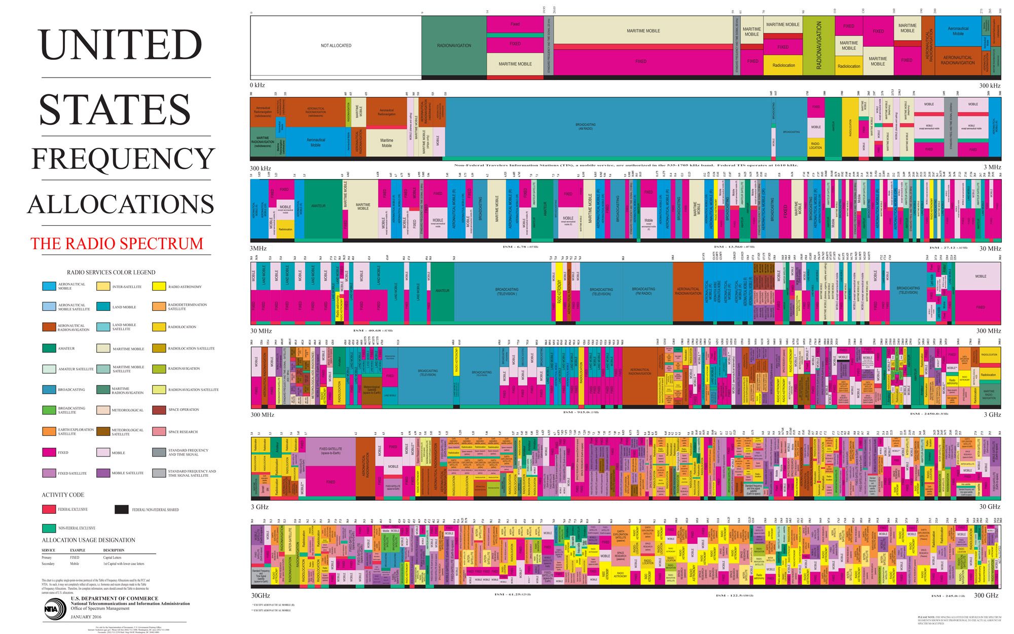
It is an incredibly complex system, and to help with the job of explaining the importance of managing this invisible natural resource, the NTIA publishes this wall chart (which you can order from the Government Printing Office as a poster for a mere $6 with free shipping!).
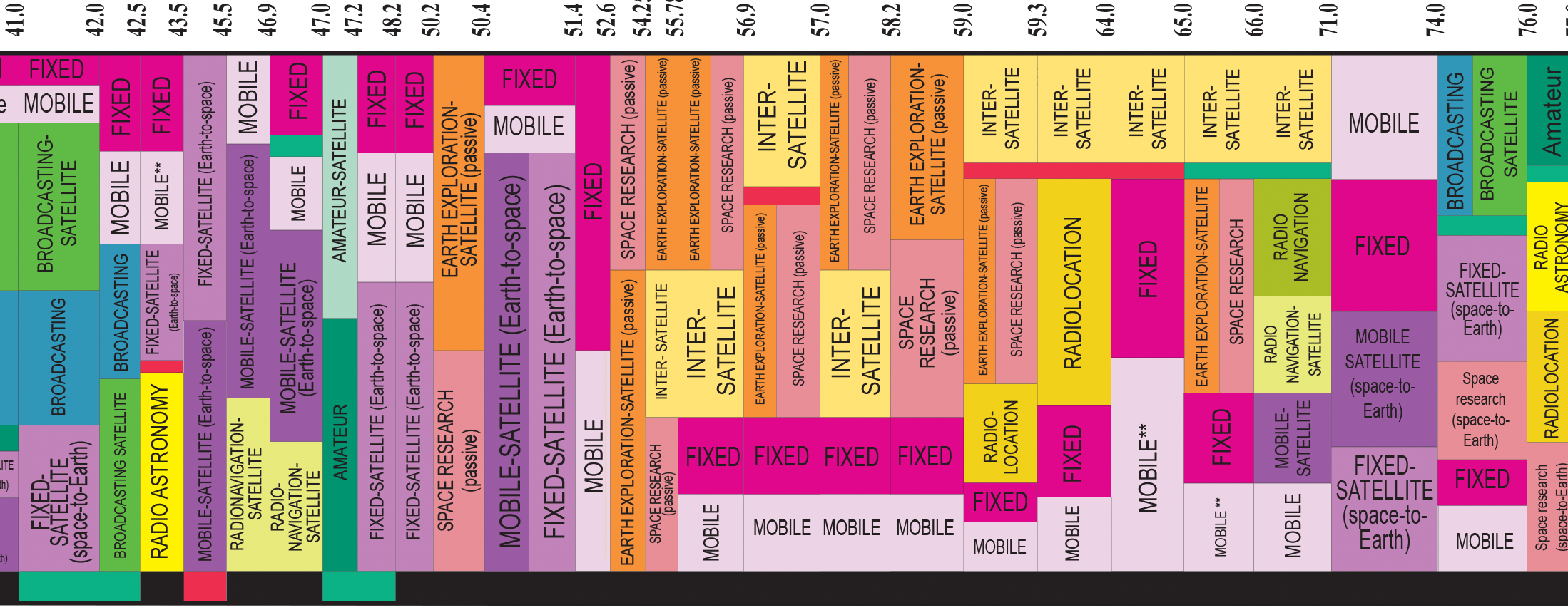
Slices of Spectrum
Not all radio applications on this chart are equal. The U.S. government lays claim to a large chunk of America’s radio spectrum for military use, communications, transportation systems, water control satellites, data transmission and time signals. Commercial broadcast TV signals (yes they still are out there) and plain old AM and FM radio have a dedicated swath, which provides probably the only true touchpoint in most people’s life with the various frequencies on the radio spectrum. FM radio is allowed to operate between 88 MHz and 108.0 MHz, and AM radio operates between 540 kHz and 1700 kHz.

Amateur radio operators (like me, KE3GAN) are granted various slices to operate safely in, and licenses are granted to all manner of businesses and institutions who use different frequencies for communications of many types (which you can look up). Civil aviation, maritime navigation, satellite communications, radio astronomy, cellular voice and data all lay claim to the colorful plots of spectrum on this chart suited to the demands of their radio applications.
The specifics of what each slice is used for appears in a lengthy document known as the FCC Online Table of Frequency Allocations, which presents this breakdown in table format, which is precise but pretty boring to look at.
The Frequency Allocation Chart uses 33 color coded categories to visualize the information from the Table of Frequency Allocations in a crazy quilt of blocks spread from 9 kHz (Very Low Frequency) all the way to 300 GHz (Extremely High Frequency).
A Popular Chart
I spoke with Eric Rosenberg, Telecommunications Specialist at NTIA about the history of the chart, how it is used, and the challenges of clearly describing the way spectrum is managed.
Rosenberg says a lot of the determinations of what service goes where on the spectrum comes down to physics and the environment it will be used in. For example, the military and weather services use a lot of microwave communications (greater than 1 GHz) for specific applications that can’t just be put anywhere on the spectrum. “You can't just pick up a block and say, okay, we're gonna move these radars over here.”

Unisex Radio Frequency Chart T-shirt (Dark)
This crazy, beautiful US government chart illustrates the incredible complexity of managing one of our nation’s most crucial – and invisible – national assets: the radio spectrum. Based on the NTIA's beautiful "United States Frequency Allocation Chart". Unisex T-shirt in light and dark designs.
Rosenberg says the chart is always extremely popular with people who see the chart for the first time, including lawmakers in Congress. The chart does suffer from scale distortions, not unlike a map that makes certain parts of the Earth appear larger than others.
“When we do the chart, part of the design of the chart is to balance the relationship between the services that are being served and the bandwidth that they have. And that is the difficulty that you get to, because the top of the chart, the first line of the existing charts…traditionally is less bandwidth, which looks like less services”, explained Rosenberg.
Rosenberg said that if you were able to increase the scale of the bottom third of the chart, the allocations would look quite different. “You would say that the allocations are individually maybe a lot bigger and there are even more services there than you think.”
Unregulated Chaos on the Airwaves
On December 12th, 1901, building on the work of other inventors, Italian engineer Guglielmo Marconi received the first transatlantic radio transmission at Signal Hill in St. John’s, Newfoundland. The signal was broadcast from a transmitter in Poldhu, Cornwall in the U.K., which consisted of morse code for the letter “S” at a frequency estimated to be 850 kHz, (in the medium frequency range).
Within a few years, the first voice and sound transmissions had been broadcast, and by 1910, ships carrying 50 or more people were mandated to carry radio communications equipment and a radio operator.
But the airwaves were starting to get crowded, and there were no real rules in place to govern who can broadcast on what frequency. Amateur operators along the coast were prank calling Navy ships at sea and chaos ensued.
Congress had already developed a plan to start regulating the airwaves by the issuing of licenses when the Titanic sank in April 1912. But the chaotic disaster involved some serious miscommunication of wireless transmissions by boats at sea as the tragedy unfolded, which raised concerns that the unregulated airwaves were putting lives at risk, and that channels needed to be defined for amateurs and others cleared only for maritime and government use.
This was the goal of the Radio Act of 1912. It restricted all amateur radio operators to a portion of the spectrum, and codified various other rules, such as the adoption of an official “signal of distress” which is morse code for SOS ( ...---... ). This was followed by the Radio Act of 1927, which set up the Federal Radio Commission, later to be changed to the Federal Communications Commission by the sweeping Communications Act of 1934.
Early Attempts to Visualize the Spectrum
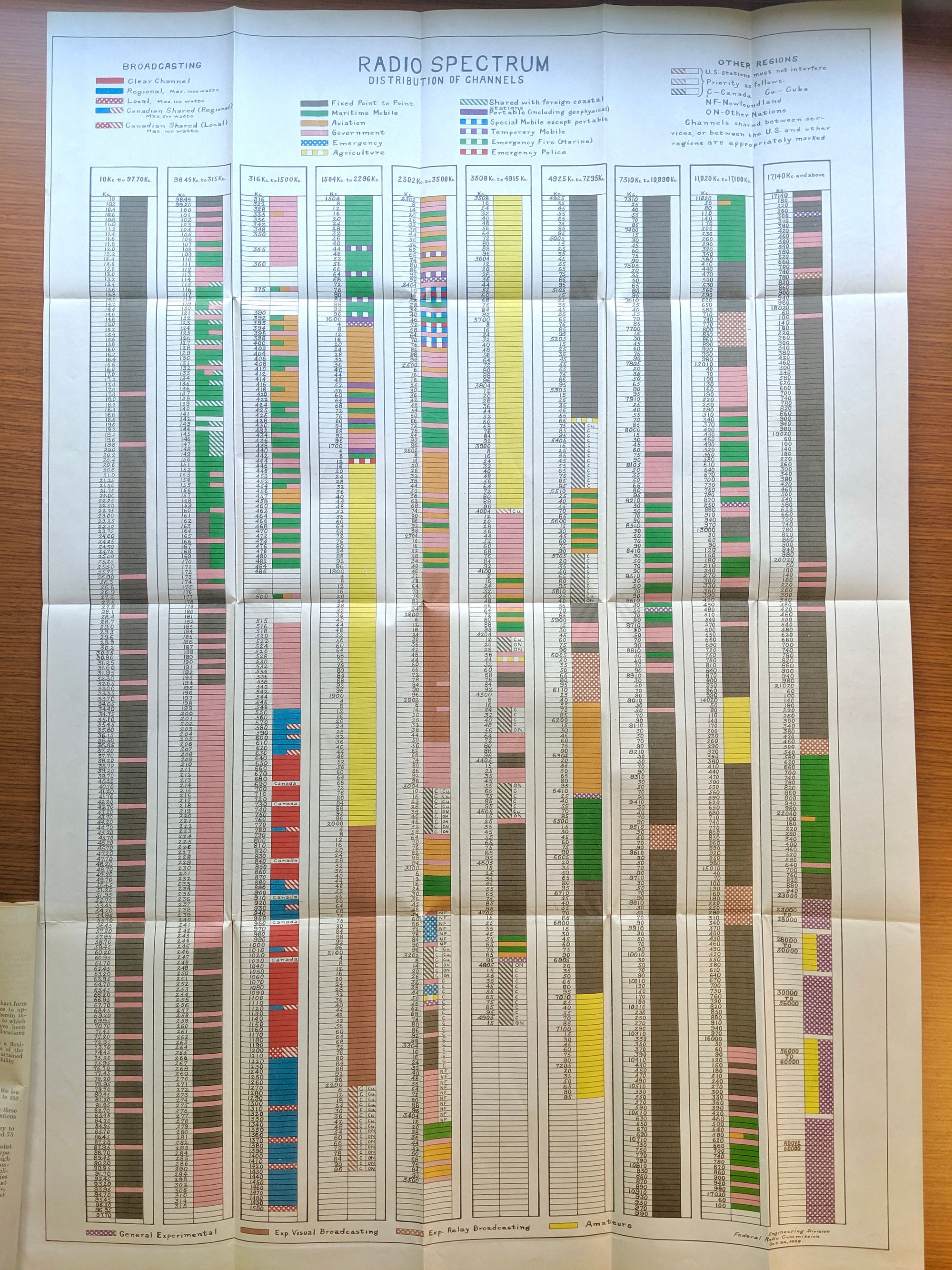
Rosenberg of NTIA shared an interesting early attempt at laying out the radio spectrum and how it was being used via vertical columns in a Federal Radio Commission chart dated Oct. 22, 1928. It spanned 10 kHz to 60 MHz. Sections were reserved for amateurs, aviation, government, agriculture, emergency use, and maritime use.
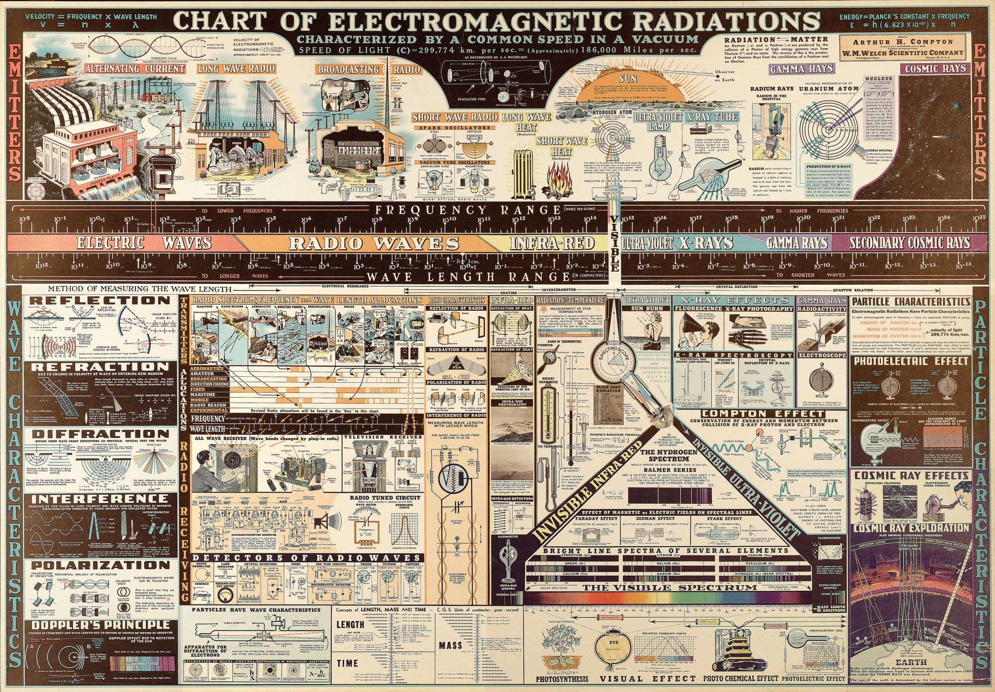
While not created by a government agency, a 1944 educational poster created by the W.M Welch Scientific Company was produced titled “Chart of Electromagnetic Radiations” was released that was absolutely crammed with diagrams describing the electromagnetic spectrum as a whole, and tons of related scientific concepts which did include some allocations of radio use. You can find a seriously hi-res copy of this on Lawrence Livermore National Laboratory’s Flickr page.
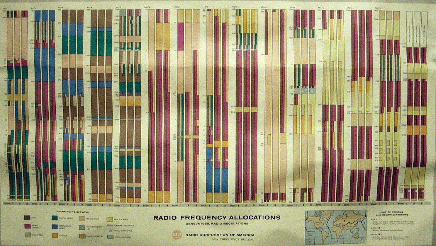
In 1959 RCA created a wall chart of the spectrum, also using a vertical orientation.
According to Rosenberg, the earliest versions of the chart created by the U.S. Government were in the 1970s, created by the White House’s Office of Telecommunications Policy, and the chart was updated periodically over 5-10 year intervals. Editions of the chart were pubished in 1987, 1996, and 2003 with the most recent version released in 2016.
Rosenberg said “These charts, they are not for planning purposes,” noting that they just represent a snapshot in time. With regards to how much each revision changed, Rosenberg said “The changes are rather subtle, so if you stack them on top of each other, you might not see any differences. And so for that reason it's a very labor intensive process.”
Rosenberg says the chart is due for another update soon. “What has happened since the one that was done in 2016 is that there have been more changes. And that's why we're getting to the point where we really feel that we need to redo it. Again it's a very large project.”
Your Country, Your Spectrum
Each country controls how its radio spectrum is allocated, but international coordination is needed, as radio waves don't care about borders. This coordination is organized by the International Telecommunication Union (ITU), and agency of the United Nations. Below are a few examples of how other countries map out their radio spectrum allocations.
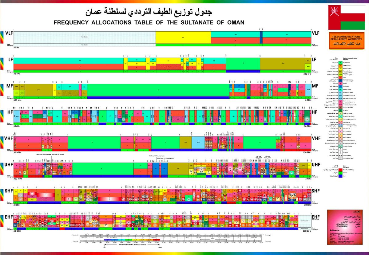
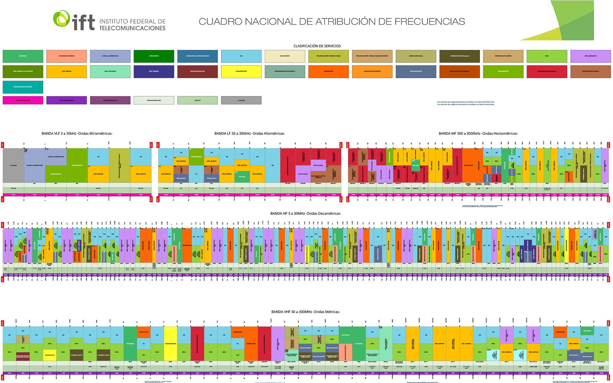
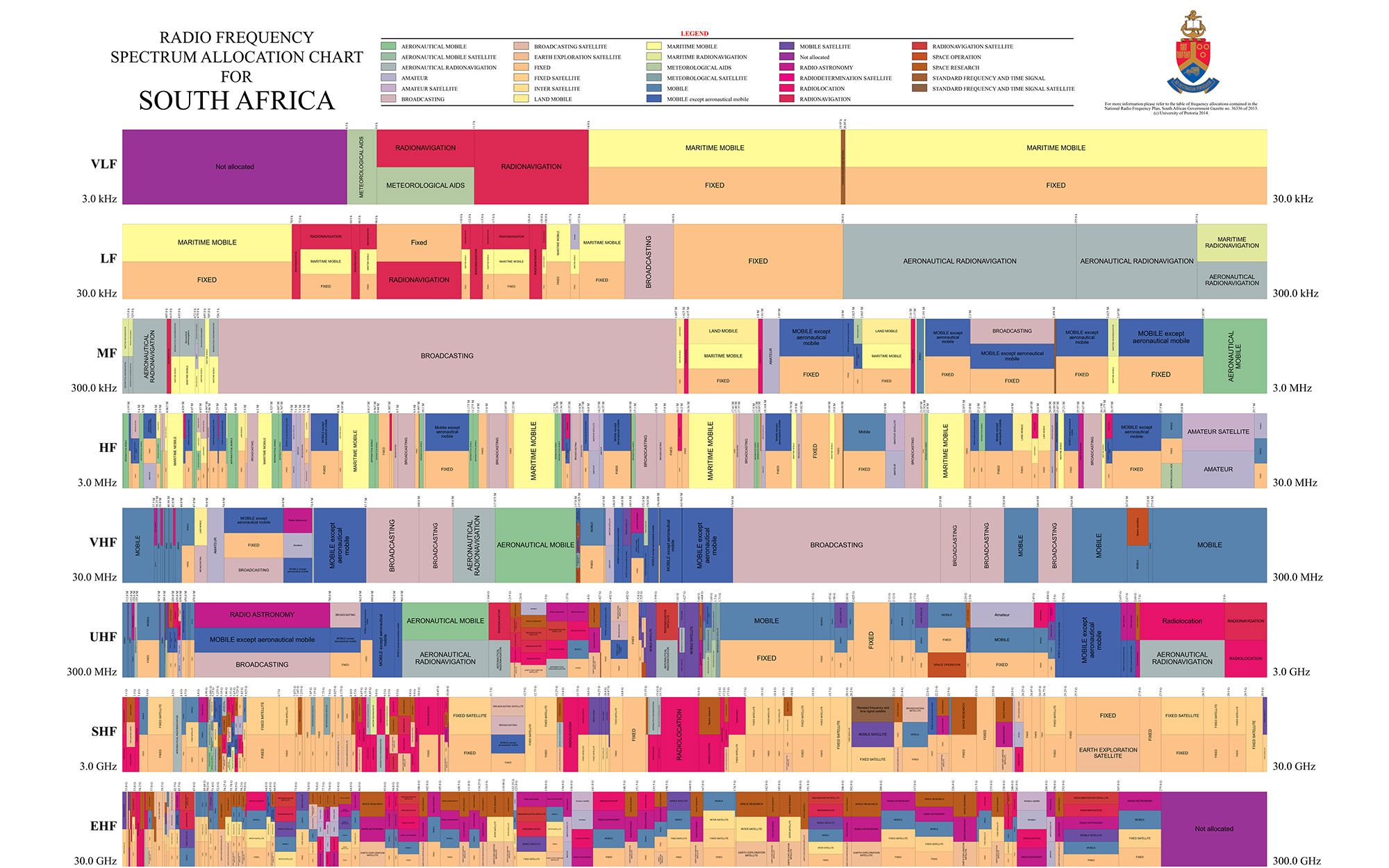
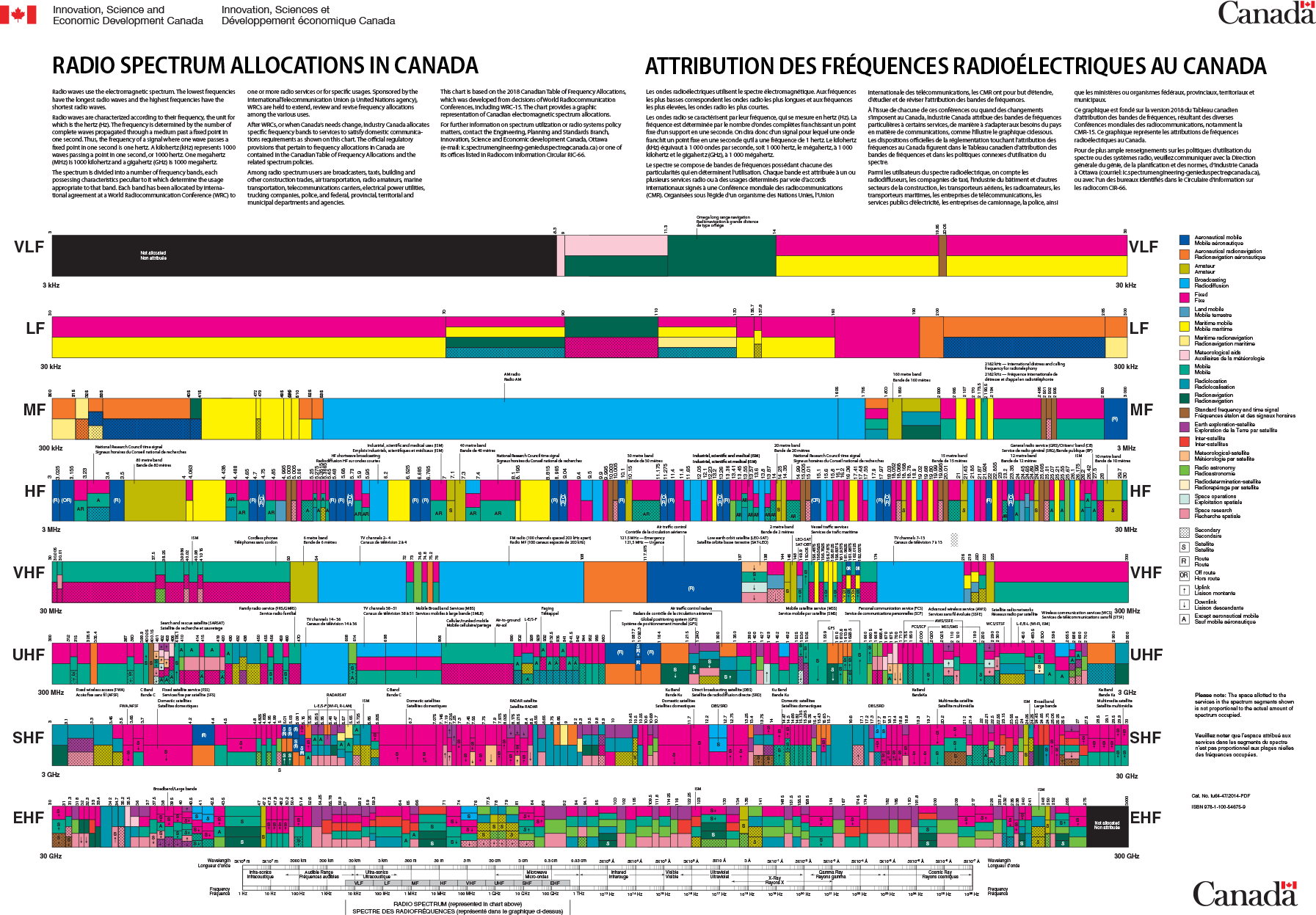
The frequency allocation charts for Oman, Mexico, Canada and South Africa.

1987 Army Radio Spectrum Diagram T-Shirt
Buried in a declassified 1987 Army Field Manual Spectrum Management document, this beautiful schematic shows "a typical, completed, armored-infantry-mechanized (AIM) division multichannel system diagram with the assigned operating frequencies using the single ABM plan."
For this post, I didn't actually have to use any code. But there's lots of fun software you can use to explore the radio spectrum using software defined radio.
Get yourself a $20 RTL-SDR USB dongle, and you will be able to track planes flying over your house, cargo ships at sea, listen to amateur radio chatter, local unencrypted police and emergency broadcasts, and even pull images and broadcasts down from the International Space Station.
And if you are nerding out on this stuff, I highly recommend studying up to get your FCC Ham Radio license, as you will learn a ton and unlock the ability to broadcast and chat with other "hams" around the world.
If you have a spare RaspberryPi lying around (if you are reading this box, of course you do) try this fantastic disk image called PiSDR preloaded with all the great open source software that you need to do the fun stuff with SDR and radio.
I gave a talk at the IRE NICAR conference in 2020 titled "Exploring the Radio Spectrum for News" that has more tips and information.
You can subscribe to our newsletter to get future posts delivered to your inbox for free. 👉🏻 📫 Subscribe now.
☕️ Buy me a coffee
Say thanks with a one time tip.
Sharing is caring
📣 If you think your followers or friends may like it, please consider sharing it.
👕🖼️ Buy Beautiful Public Data merch on our Etsy shop
Unique t-shirts and prints inspired by our stories
🙋🏻♀️ If you have any suggestions, comments or requests, please email them to beautifulpublicdata@gmail.com
Thanks for reading!
- Jon Keegan
Bluesky: @jonkeegan.com
Mastodon: mastodon.social/@jonkeegan