
The footprints of every building in NYC
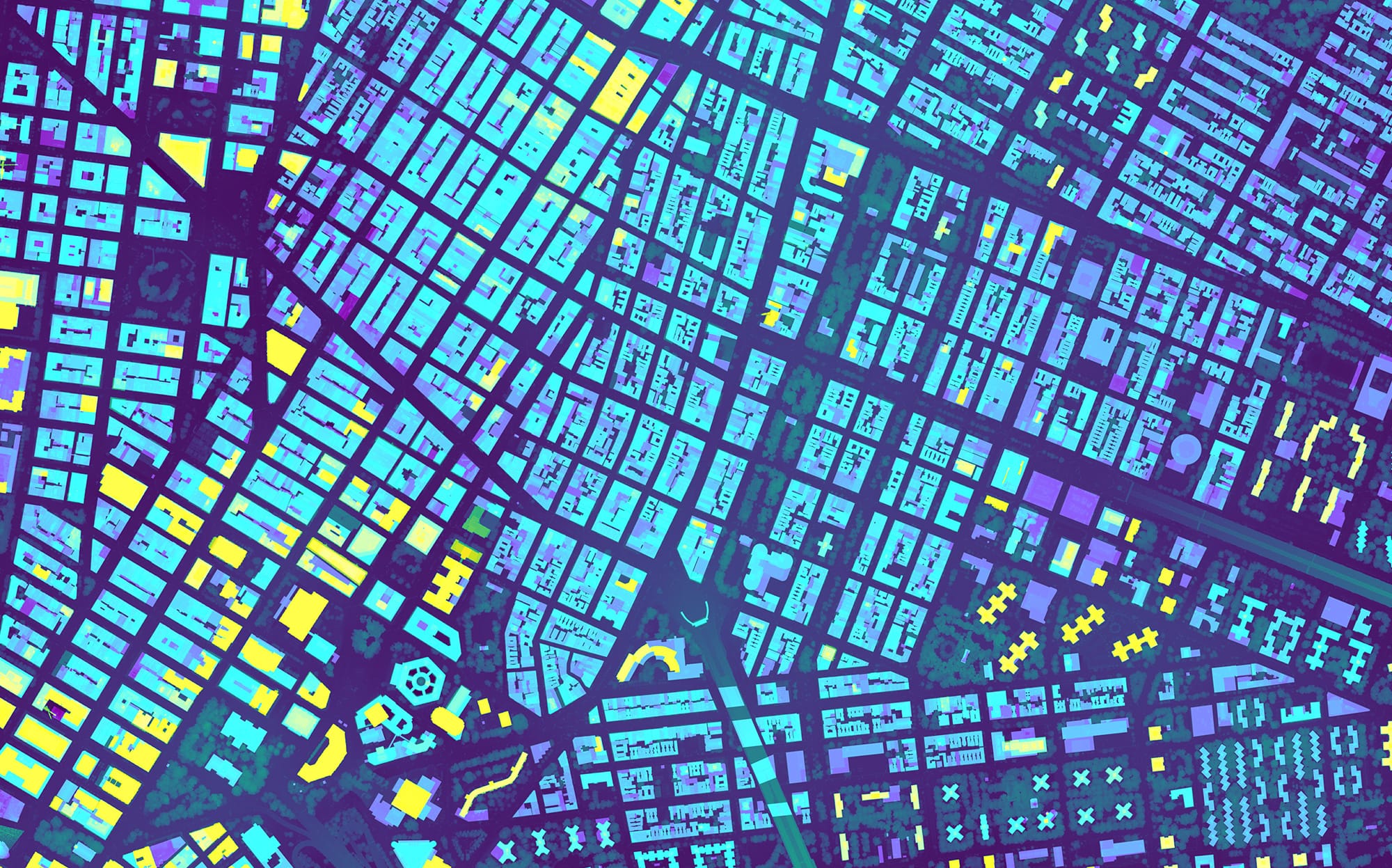
The landscape of NYC changes so much that the New York City Office of Technology and Innovation updates a dataset of building footprint shapes weekly.

I can't believe this is the first time I am writing about an NYC dataset.
The scale of New York City can be overwhelming. Over 8.5 million people are estimated to live in the five boroughs of NYC, squished into 300 square miles, making it the most densely populated major city in the US.
All of those people live and work in buildings of vastly different sizes and shapes — soaring skyscrapers, 200-year-old brownstones, single-story houses, and everything in between. As of July 13, 2026, there are 1,082,974 buildings that New York City tracks. Anyone who has spent any amount of time in NYC knows that the city is under a permanent state of construction, and demolition — massive new buildings just pop up out of nowhere all the time.
The pace of change is so rapid in fact, that the New York City Office of Technology and Innovation (OTI) publishes weekly updates to one of its most fascinating datasets – the footprints of every building in New York City. The OTI says that its accurate basemap provides “the foundation upon which virtually all other geospatial data within New York City government is registered.”

What’s included in this data?
Like I said — this dataset has all buildings in NYC. The OTI says it counts every building greater than 400 square feet, and taller than 12 feet. The items that aren’t counted: temporary trailers, tents, movable jet bridges, awnings, scaffolds, sidewalk sheds, and any backyard storage sheds.
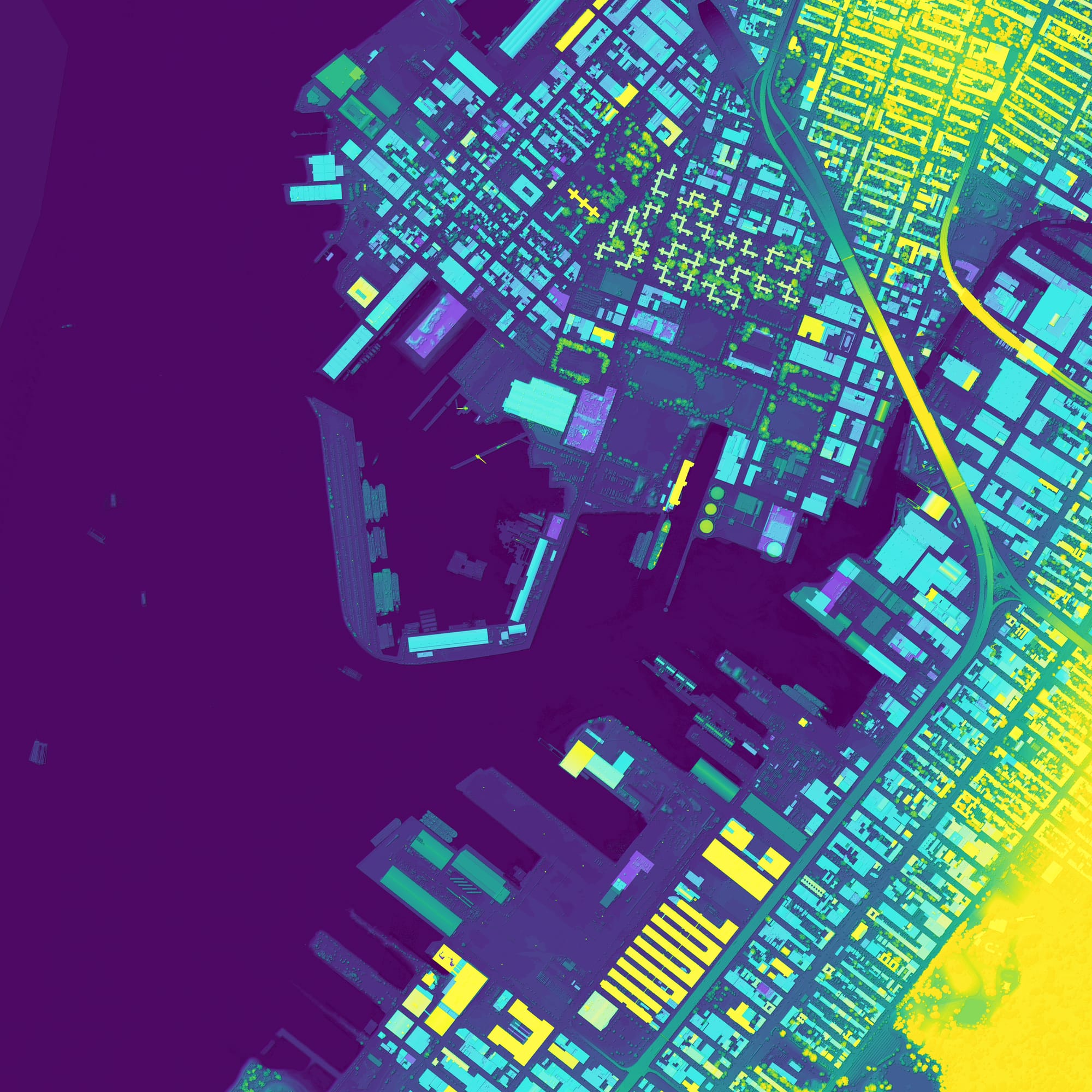
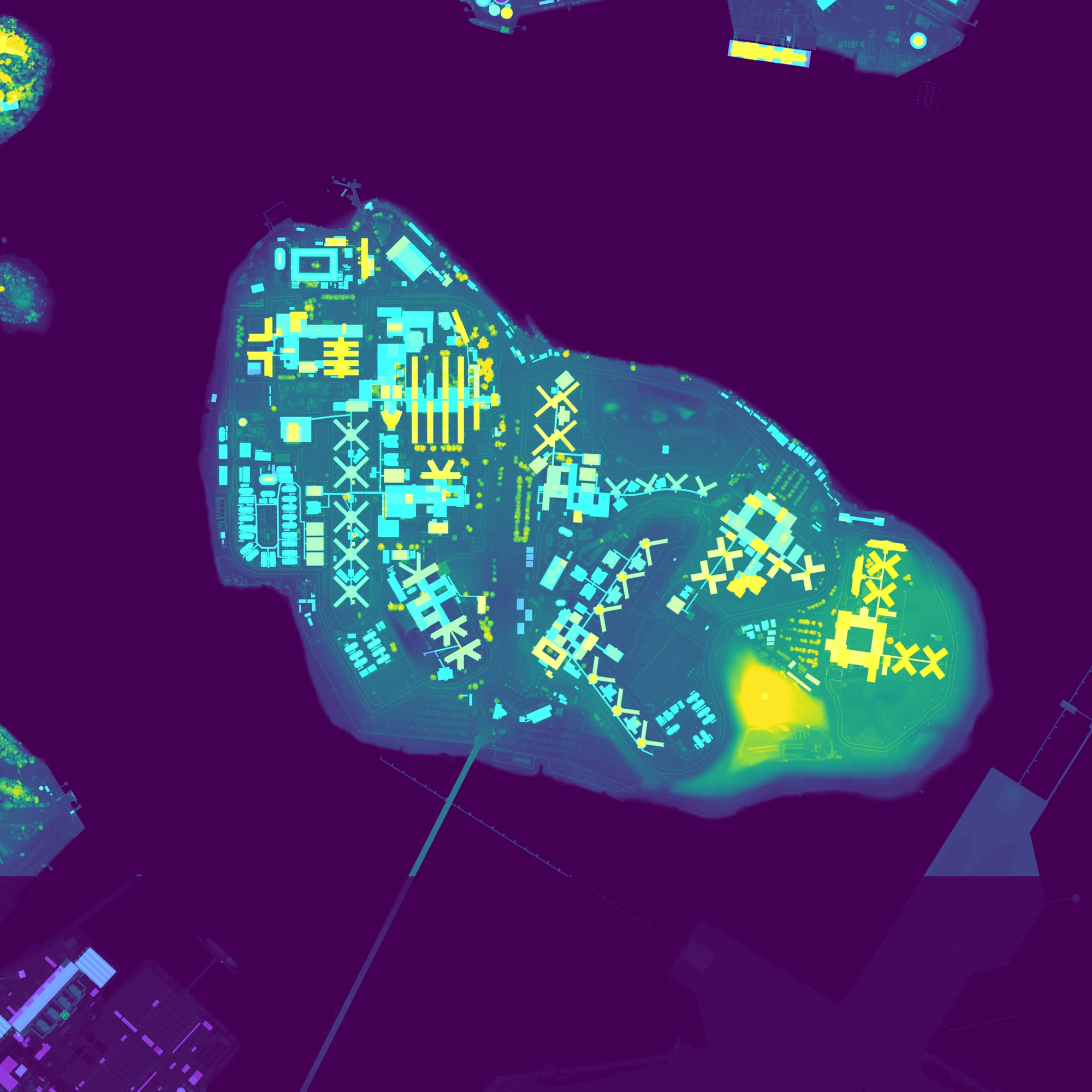
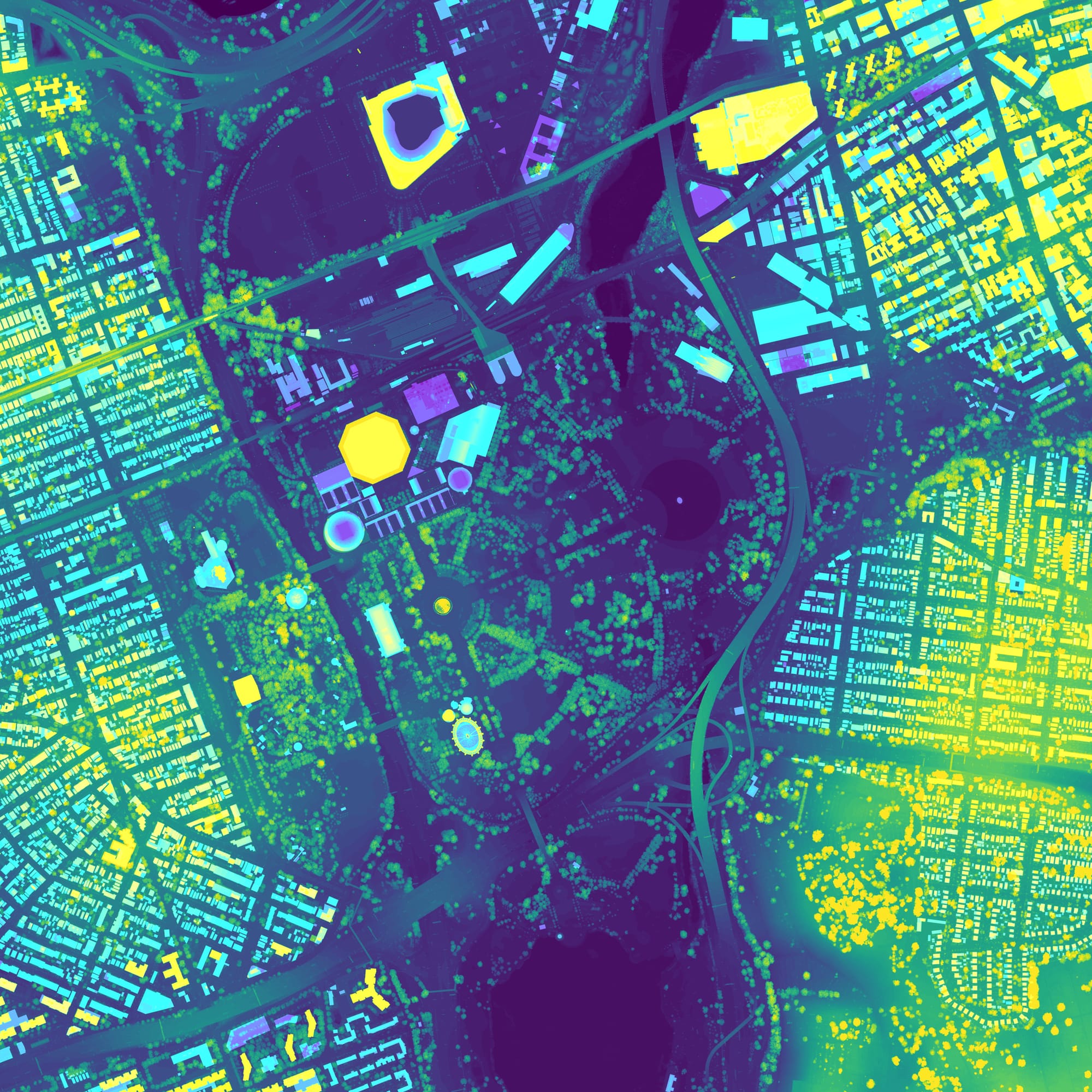
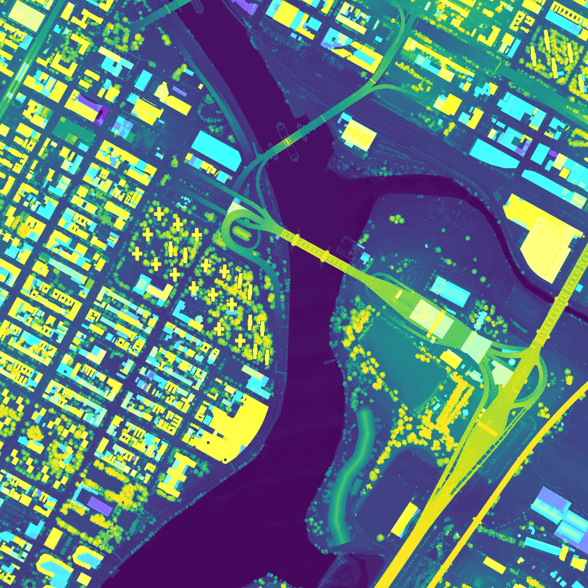
Clockwise from top left: Red Hook and Sunset Park, Brooklyn; Rikers Island; Flushing Meadows Corona Park, Queens; Randalls and Wards Islands, Manhattan. Visualizations: Jon Keegan / Beautiful Public Data. Data: New York City Office of Technology and Innovation
The dataset contains classifications for the structures. The vast majority are listed as buildings, but other types are in there as well. For example, one-fifth of the structures in the data are garages.
99% of buildings in the dataset have a construction date, so we can get a glimpse of when the busiest times for construction were (although this dataset only contains buildings that are still around today). Nearly a quarter of all existing New York City buildings were constructed in the 1920s.
The height of the buildings in the dataset doesn't tell the full story of the city’s tallest buildings you might be familiar with. One World Trade Center’s enormous spire brought the total height of the building to a symbolic 1,776 feet. But in the data, the height of the roof is reported as 1,408 feet. The Council on Vertical Urbanism’s Skyscraper Center lists One World Trade’s “occupied” height at 1,268 feet. The discrepancy is likely due to what the photogrammetry defines as the roof.
How is it collected?
It may seem to be practically impossible to precisely measure so many buildings that change so fast. If you are picturing an army of city workers with tape measures, you have the wrong idea.
The vast majority — about 93% — of the measurements of the city’s buildings are generated by photogrammetry (deriving 3D geometry from a series of photographs). The OTI’s data dictionary for the data says that annually captured oblique aerial imagery from Eagleview and ground-level panoramic photography from Cyclomedia are used to generate the measurements of the buildings, along with Department of Building research and other city records. The remainder of the building data is entered manually using other less accurate methods.
According to the OTI, 95% of the footprint data is accurate to plus or minus two feet.
History
There’s a lot of history in this data. The oldest building still standing today in NYC is in there — the Pieter Claesen Wyckoff House in East Flatbush, Brooklyn, which was built in 1652.
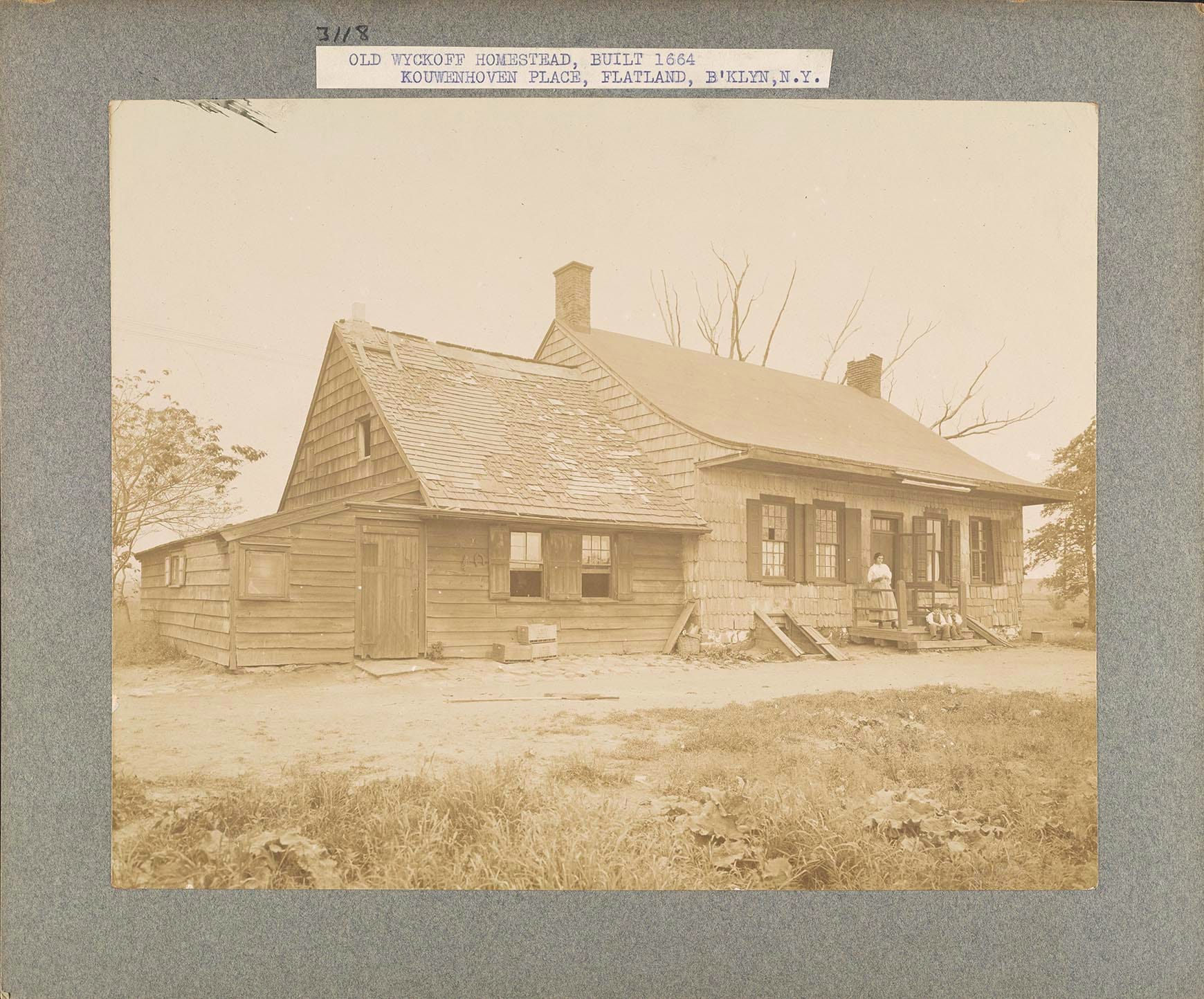
NYC has been using aerial photography for over 100 years to catalog and measure the city. Thanks to some superb data preservation, you can explore some amazing aerial photography data going back to 1924.
And what about all of those buildings from the past are no longer with us? Don’t worry – there’s a dataset for that. NYC’s “Building Historic” dataset contains “buildings that have been demolished or significantly altered.” This dataset follows pretty much the same format as the current building footprints, but with an additional field for construction year or alteration year.

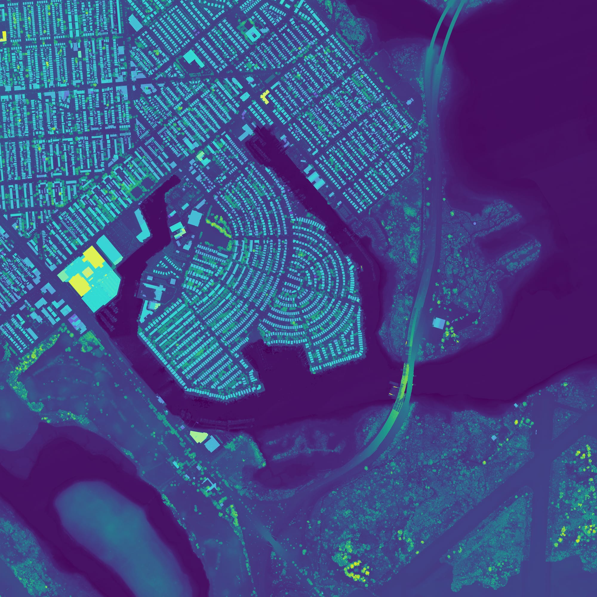

Left to right: Governor's Island; Mill Basin, Brooklyn; Midtown Manhattan. Visualization: Jon Keegan / Beautiful Public Data. Data: New York City Office of Technology and Innovation
Captured in this set of ghost buildings you will find whole city blocks that were stamped out of existence, like the one that contained my old Prospect Heights, Brooklyn neighborhood dive bar Freddie's, which was erased to build the Barclays Center and the Atlantic Yards project.
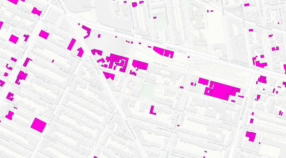
Looking at the buildings that were demolished that also had a construction date, we can calculate the lifespan of the buildings that are gone. 14 of the demolished buildings were over 200 years old. You can explore these missing buildings in an interactive map here.
Layers upon layers of spatial data
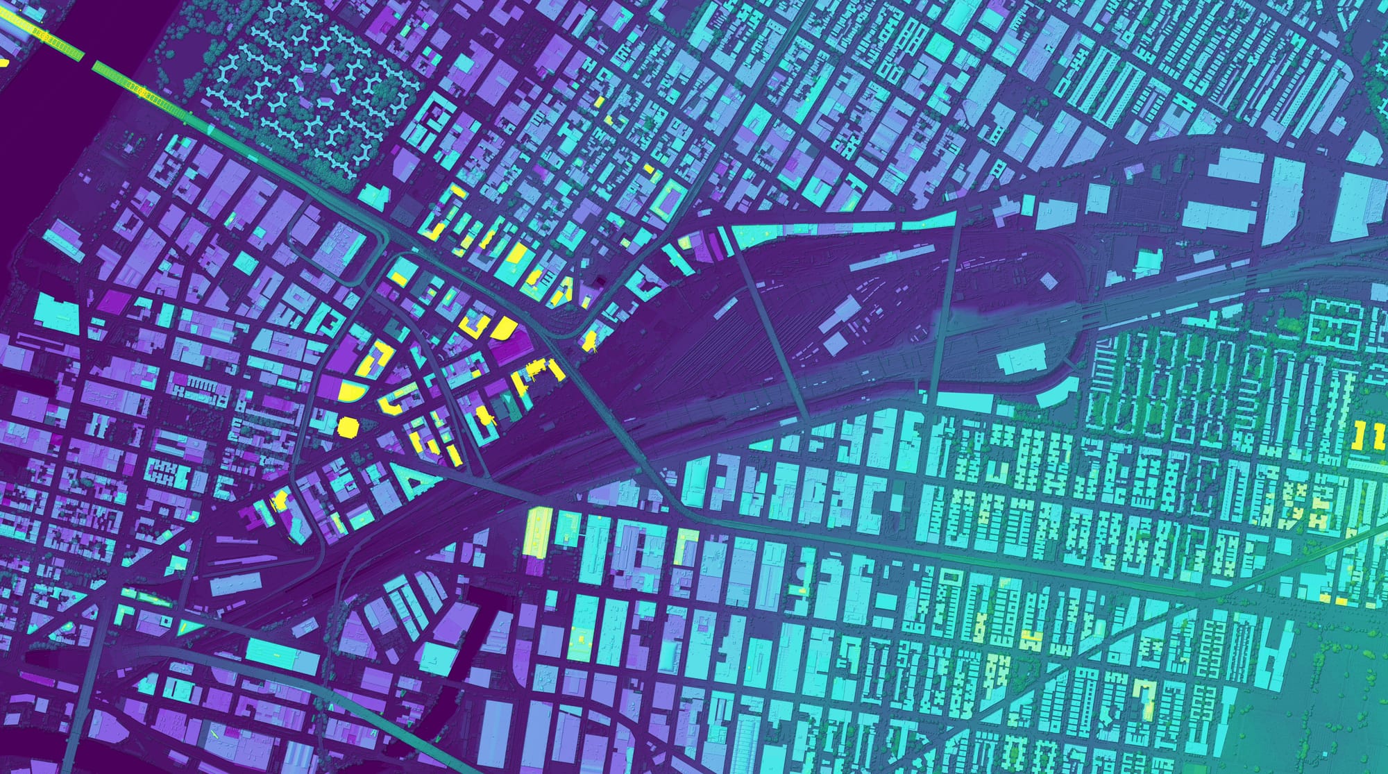
I loaded up the footprints shapefile into QGIS and created these visualizations that use a color scale to indicate elevation (the building roof). Brighter colors equals higher elevation. I also imported a full-city digital surface model (DSM), which is generated by LiDAR scans gathered by low-altitude airplane flights over the city.
 Jon Keegan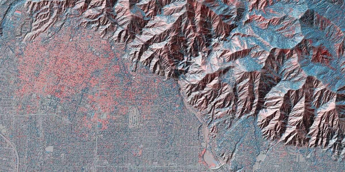
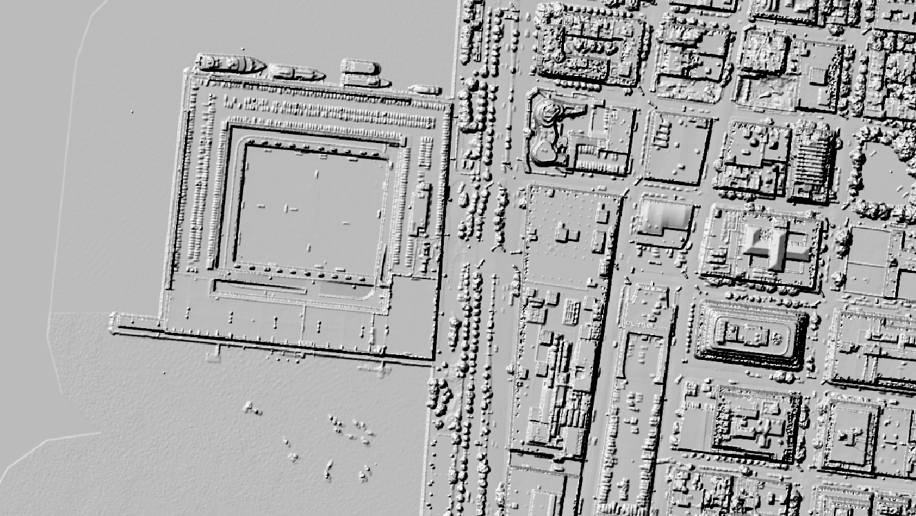
The DSM captures hills, trees, bridges (parts of them), train tracks, and even airplanes on the tarmac at JFK and LaGuardia. Combining this layer with the crisp building outlines makes for a vibrant map of the many elements of the physical city that are captured in this fascinating public data.

Merch featuring data from our stories
 New
New
MUTCD highway signs tee
Source: FHWA
Hundreds of the signs you drive past every day, straight from the style guide for America's highways.
Get the shirt → New
New
New York USGS geologic map tee
Source: USGS
A beautiful map of New York's unqiue geology on a tee, featuring data from the USGS' most detailed visualization of the geology of United States to date.
Get the shirt →
SoCal AIS vessel tracks framed print
Source: NOAA
A year of ship traffic on the U.S. coastline, accumulated into a single dense image. Features Los Angeles and the Southern California coastline.
Get the print →For this post, I downloaded shapefiles, and DSM files from NYC's fantastic, extensive Open Data portal. I loaded them into QGIS, and combined the building footprint shapefiles with the DSM file, which I applied a "singleband pseudocolor" color scale to visualize elevation.
You can subscribe to our newsletter to get future posts delivered to your inbox for free. 👉🏻 📫 Subscribe now.
☕️ Buy me a coffee
Say thanks with a one time tip.
Sharing is caring
📣 If you think your followers or friends may like it, please consider sharing it.
👕🖼️ Buy Beautiful Public Data merch on our shop.
Unique t-shirts and prints inspired by our stories
🙋🏻♀️ If you have any suggestions, comments or requests, please email them to beautifulpublicdata@gmail.com
Thanks for reading!
- Jon Keegan
Bluesky: @jonkeegan.com